Saturday, November 22, 2014

Stop...Hammer Time!

The Making of the Nail and Hammer

This was the first major project where I attempted to make a realistic object within Maya, in this case it was a hammer and nail resting on grass. To create the hammer, I created a cube in the center of workspace, and elongated it to about 7 times the original size and 3 times the original width. Finding the correct tools to create this, however, was a challenge as it was hard to find the right one for the correct purpose at hand. But eventually I got the hang of it as I used the face extrude tool to create the claws of the hammer and the head. I then manipulated each of the faces and reshaped them into the figures that was reminiscent of a hammer. To make the handle become smoother and more realistic looking, I selected the vertices of the middle part of the hammer handle and squeezed them closer together, and used the bevel tool on the edges to smooth them out. I then used a Lambert on the metal hammer head and raised the luminosity so it was reflective when a light was exposed to it and so it had a metallic quality and texture. Selecting then a wooden blinn for the wooden handle, I altered the appearance and color of the wood to make it fit the metal head well. I then shaped a nail out of a cylinder by extruding both the top and bottom faces of the tube, extending and stretching the bottom one into a point while the top was extruded a little, and then manipulated to have a flat, wider top. I repeated the process of the hammer head to the nail for the color and luminosity. After putting in a plane, I added a grass texture for the hammer and nail to rest on. Adding three different light sources, I added a spotlight over the hammer, and two directional lights that casted shadows over the grass terrain. It also eliminated the annoying black shadows that limited the view of my creations.
Along the way, I learned how to extrude faces and to manipulate them to look like certain creations and how to make them look realistic in the process. I also learned how balance this project when there were a few other projects I wished to catch up on. Although I am proud of my attempt, I wish I had done the hammer handle a bit differently, like adjusting the proportions. But I would keep the nail, as it came out better than I expected it would. Next Maya project I would do would include these lessons I learned, like manipulating faces and using directional lights to correctly illuminate my work.
The entire project I loved to do in general, as it was a simple, but fun task to accomplish. I hope that for our next Maya project to come that it is how to do living creatures perhaps, or maybe beginning to animate them.

Good Kangaroo Hunting


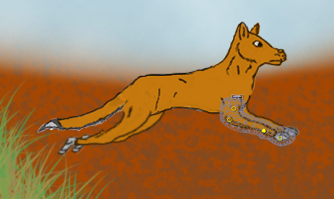
In the midst of an Australian Outback, a hungry Dingo hides in wait for an unsuspecting Kangaroo to fall into his trap...


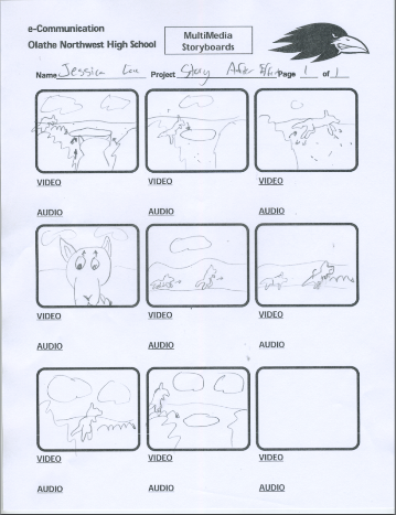
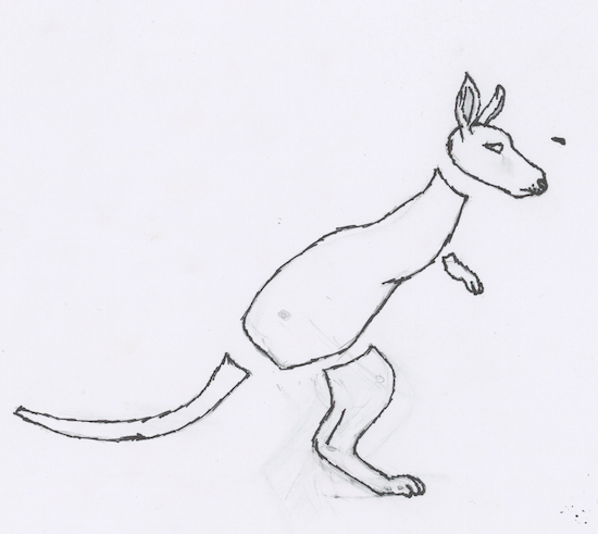
This was the first character story I've attempted this year, about a dingo hunting a kangaroo, but failing as the kangaroo speeds away. Using a combination of Photoshop and After Effects, the animation was done and done well. After drawing my two characters, the dingo and the kangaroo, I then extracted them from the paper using Photoshop and colored them accordingly. I then decorated backgrounds of the Australian Outback with a soft brush for the land and a dotted brush to create the sandy texture. I then used a grass texture to make tall and dusty blades of grass to put into the background. Transferring them all into After Effects, I then began animating each limb separately, altering the positions of the keynotes when they are needed. Then, I put in the backgrounds and placed the finished animations into each proper scene. I then created another composition in After Effects and put in the finished scenes in the correct order. Once I finished adjusting the length of the scenes, I rendered it out as an mp4.

Over the course of this story animation, I learned that how watching your inspiration of your characters can help make them better animated, and how to make a running four legged animal. I also learned about the importance of time management, as I had scenes being worked on longer than I had previously expected.
Yet even as I'm proud of my work, I still see areas that I need to improve on or change. The first would be on how to make the characters move more naturally, and maybe how to make the dingo run better. What I would change is the story, as I wish to do different animals next time. However, I do like the backgrounds I created and the characters conceived to live within them.
The experience of working four-legged animals however, is what I'll take from this project, along with the knowledge of how to make different shots of the same animation.

This was one of my favorite projects to create and to make, as I fell in love with the characters and story I made. I'm proud of my work so far and what is yet to come has me even more excited, as I know I'm improving.


In the Shadowed Path

Casting Shadows

Link to Morguefile.com:
http://www.morguefile.com/


This project was used to learn how to create a shadow for an object inserted into a picture in Photoshop. I obtained both photographs from the website Morguefile.com. After downloading both of the files, I opened them in Photoshop. Using the quick selection tool, I quickly took the leopard out of it's original photo in order to get the leopard by itself. But still, there was a faint outline of the original background. Using the Defringe tool to eliminate this annoying pixel fringe-like halo, I was finally left with the Leopard alone in a transparent background. I then copied the layer of the Leopard in Photoshop, and used the warp tool to shape the duplicate layer into a shadow position. Gradients were then used to create the dark to light contrast within the shadow. Finally, I lowered the transparency of the shadow so there could be showings of the background layer peeking through the silhouette of the Leopard.
Along the way, I learned how to warp duplicate pictures into shadows just by using a warp tool to make it look like the shadow is natural. Also, gaining the knowledge about how the project can be used, like to make a book cover or a poster look realistic.
I loved the resulting picture, but next time I would swap out the picture of the Leopard to do a different animal, so as to see how they would compare to my completed project. Yet I would keep the background picture, as I feel it is a perfect picture to practice inserting other animals into.
For future projects, I would use the shadows for making realistic photo alterations. Like attempting to create a poster for a movie I saw. In general, I believed this project to be a fun and great success, and I am excited for future endeavors utilizing new skills acquired by the actions needed to fulfill the requirements for this project.

Monday, November 10, 2014

The Love-ly Isle of Dracon

The Love-ly Isle of Dracon


The Floating Island entailed learning about extracting pictures and eliminating the pixel fringe around the image so you could combine several pictures together to form an entirely new photo. Using Photoshop, I extracted the island from a photograph of an island off a beach. I then embedded it into the cloud photo used behind. Taking a copy of both pictures, I copied them and made the copies darker so it has a dramatic feel to the photo. I then selected a cloud and copied it in front of the image of the island, to make it feel like the island wasn't just pasted in front of a picture. Along the way, I found out how to copy a selected portion of the isle to create a point at the end of the island to make it look like a spire.
Finding dragon pictures on the internet, I embedded them into the picture to make them look like they're flying around my floating island. I found out how to cast their shadows on the clouds by using a dark brush tool set to a low opacity. Finally, I used a picture of stars, set the picture in front of all of the others, and then used screen lighting to get rid of the black space and leave the stars as snowflakes blowing in the air. All in all, I loved the project, as I got to exploit some of my creativity. But one thing I would change if I could would be the type of dragons I chose for this project, as they were not the easiest to embed. Yet the snow I would keep, as it makes me feel like my project stand out among my peers'.
Perhaps in future projects I would be able utallize the abilities to take out photos and combine them in different ways so I could create things like book covers or posters. I truly enjoyed this project and hope for more like this to come in the near future.


Tuesday, November 4, 2014

Sphere Projects

Sphere Projects


Shiny Earth Tutorial Link:
http://design.tutsplus.com/tutorials/create-a-shiny-earth-with-photoshop-3d-layers--psd-4838
Glowing Layer Sphere Link:
http://design.tutsplus.com/tutorials/quick-tip-create-a-colorful-sliced-sphere-to-use-as-a-logo-design--vector-4087


Spheres represent the world, how large it could be and how small at the same time. How it feels both safe and unique. Spheres can also mean the entirety of province or domain of an object, like how AT&T's spherical logo represents their worldwide coverage. I created two different spheres for Illustrator and Photoshop, a glowing sliced sphere from Illustrator and a 3-D Earth reflection from Photoshop.
The work for both Illustrator and Photoshop was relatively smooth, little to no problems from the exception in Photoshop to try and get a cloud layer to connect with the 3-D earth. But in Photoshop, it was easier to create a 3-D look, accomplished by wrapping a photo around a sphere, to apply the shadows and drop shadows to each layer, and to change and redo the aspects of each sphere.
In Illustrator, the effects was much more detailed, the glowing effects looked more natural and beautiful, and the sphere looks vivid and lively compared to Photoshop's.
I learned something different for each tutorial, to create a light, glowing feel to objects in Illustrator, and how to create cool 3-D images in Photoshop by making a picture wrap around a 3-D figure to create a cool effect.
But I do want to learn about how to create other 3-D objects in Photoshop, instead of just spheres. Like how to create characters that look and feel realistic. In Illustrator, I hope to learn how to create glowing effects to other objects, like creating a neon text font.