Tuesday, December 20, 2016

Professional Article Review: Doctor Strange's "Strange Effects"

Purpose of the Article:

The article discusses the laboring process of making the strange effects of the magic within Doctor Strange. The author also explains the inspirations behind the effects behind bending and twisting reality in the movie were similar effects used in Inception, and that the process of making, creating, and implementing the methods to create Doctor Strange. They use the evidence of both speaking to the VFX production supervisor, having watched the movie, and the supervisor explaining what they did on previous projects that helped create Doctor Strange's world. The strengths of this article is the feeling that this person who wrote it is generally interested in how Doctor Strange's animation was created, and having some evidence to back it up. But that is also is a weakness, as the author only really has one reliable source for his article so there's nothing else really backing up his claims. The author seems to conclude with saying that the impressive animation was created by the tenacity of the people involved, who worked with similar deadlines in Guardians of the Galaxy

My Own Conclusions:

Generally, my critique of the article is that even with the only resource being that supervisor, I found the article sound and informative. It is interesting to see the time and effort and thought that went into scenes of Doctor Strange like the final battle with Dormamu. It is significant due to the need to show others how exactly the movie was as spectacular as it was. The argument stands up on its own to display the work that went into the movie and the methods used to achieve the effects. The evidence is convincing as well if one of the main head honchos behind the effects agrees with it. I believe these effects inspire me as an animator to see what others can achieve in deadlines like 6 months. I honestly understand most of the article, as the author took the time to explain what each difficult term meant and the reasoning behind his writing. So all in all, it is a well written work attributing the credit for the animation to the people who deserve it. Well done Disney, yet again!


Read the Article for yourself! Link

Professional Project Review: Shelter

The Project:

Shelter was a collaborative piece from an American music producer, a French Music Producer, Japanese animators, and distributed by CrunchyRoll. This was made as a music video for Porter Robinson and Madeon's song "Shelter", which was released on August 11th, 2016. It was then announced that both the producers had been working for over a year to create a music video with a story and plot to accompany the music. So it was released on October 18th of the same year to large success, as the deep, emotional story connected with the music as if both were made for each other. The hand-drawn animation looks beautiful, as the backgrounds and environments created are gorgeous and inviting.

The Story:

The story follows a 17 year old girl (named Rin in the description) who lives alone in a simulated reality, which she controls by drawing on a tablet to shift the reality on what she wants. She then discovers scenes that she didn't make and discovers (through flashbacks, newspaper articles, and past memories) she was once a child in Tokyo who lived with her father. But Earth was about to be in collision with an object the size of the moon. So her father, while still being loving towards her, built her a ship with life-support system for Rin to escape the doomed Earth. So she has been in space for the past 7 years, waiting for someone to make contact with her. At the end, a message comes up as Rin vows to make her father's sacrifice worth it.

My Thoughts:

I honestly love the animation to bits, as it was gorgeous to follow the story. I would want to apply the interactions of the environments to my own work, as it looked fluid and clean to me. I believe the shifting backgrounds and different angles for camera shots are applied well to this piece (which I've done before). The creators did well to have an animation serve the story and song justice so it was explained well, but they could improve upon maybe the ending. The ending was a bit confusing and left up to interpretation on how Rin will handle the message received at the end. But overall, I loved it. It was so beautiful and nearly had me in tears at the end of it. I recommend anyone to watch the differences between American and Japanese animation, as well of the power of collaboration between all these different people.


Friday, December 16, 2016

Semester One: Done!

Magical Mischief: The Project Summary

The semester project that I've been working on had finally concluded in a timely manner. My animation, the sound effects, the music, and even credits were done in the past week and I feel proud. I believe my quality of animation has improved since Midnight Flight, and I added a story element previously missing from the previous animations beforehand. I followed the storyboards more than my previous venture, added as well as subtracted scenes that would either hinder or help the animation win the coveted Pixel at eMagine that I desire. I observed various different animation styles over the course of the semester, such as the scene of the boy's toy flying through the desk utilizing the ability to put in 3D elements in a 2D animation. I enhanced my hand-drawn elements by adding a hand-drawn background painted in photoshop, so it has more definition in both characters and backgrounds. I pt more detail into my characters as well due to the comments from last year that my characters were not that detailed or visually interesting.

What to go from here:

I hope to make another project to implement more 2D elements for another fun project like this (probably if anyone knows me, involving dragons again), maybe another short story animation. Perhaps even adding more complicated elements into it to maybe get two Pixels at the same time (like my goal I set for this year). Hopefully I can get another decent idea to try and attempt before this year ends and I can start ASAP.  The Story-Boards below are sections of what I did to animate for my project.


 My animation: https://www.youtube.com/watch?v=tcFPttYzfIE

Tuesday, October 11, 2016

New School Year, New Project: My Own Sorcerer's Apprentice


To Boldly Try What I Haven't Tried Before

Why this project and idea?

One of my favorite animations growing up was the Sorcerer's Apprentice section from Fantasia, as I loved the thought of mischievous Mickey Mouse messing with magic, only for him to lose control of it to get his just desserts. It began my love, I believe, of mythos and magic that continues now.
But also, I wanted to make a more story-driven project compared to last year due to the comments and concerns given to me last year from my project entered into eMagine. Also, I wanted to try to animate a human character alongside a creature this time, taking more time to make them look decent and realistic.
The main reason, however, is to show that I could accomplish this project in it's entirety, and not procrastinate and make something that could be both cute and cool.

The Scope:


Beni
I plan to have three characters; Beni the Apprentice, Keiter the Senior Wizard, and Austie the creature companion of Beni. Beni is an apprentice wizard who is powerful, but very untrained in magic. Keiter has to leave to gather more supplies to a potion, and cautions his charges to not practice anything while he's gone and leaves. But Beni decides to entertain himself by flying a small dragon toy around the room, which hits a glass jar containing a fairy. It escapes and now Austie and Beni now have catch it before their master gets home.
I do have walk cycles completed for both Beni and Austie, as well as a run cycle for Austie that I will display here. I am currently working on the backgrounds and sets as well as the other scenes. The links to the tests are Austie(run), Austie(walk), and Beni.
Austie

Conclusion 

So far, where I'm at for this project, I'm confident in my abilities to make this coherent story as best as I can make it. It's both exciting and exhilarating to attempt a project at this scale, and I am hopeful to pull off my best animation so far within the program! So for now, I will continue to create new animations to try to wrap the story together.

Thursday, May 19, 2016

End of the Line (Or Year)

Welp, I guess this wraps things up.

I learned this year that in order to make a project that you will truly be proud of, you have to be able to take criticism for it as well as use your own skills to balance out the help you get from other people. This year I've greatly improved my ability to both know when to step back and let others pull their own weight as well as take leadership if need be. Collaboration projects like the Montage animation that we did for stop motion showed our willingness to work together. But it also showed our inability to be patient and look to make sure things were perfect before actually putting the animation together. I also learned how to crete good flowing animations like Midnight Flight and the start of the Time animation and Itzal. 


I learned by both watching other similar animations on YouTube, in theaters, and on TV. I drew poses for the frames by watching the way animals moved and studying the walk cycles of the creatures. That's how I learned how to do Chucho's walk, which is mixed between a cat and a dog, and was able to create my own spin on how to make him move. I also learned to plan out the animations and storyboard before actually animating. It helped as I was watching behind the scenes to movies, I got an idea for an animation, and I just began drawing out a short story-board to help organize my thoughts.
This has helped me become more confident in my own ability, and grow as an animator. Projects like my Itzal project and Midnight Flight showed me that I could create cute animations with my own ability. I learned the importance of drawing out a story, and it helped improve my work quality. It even got me to win imagine despite my own lack of confidence of my work. The reason why the lessons I learned helped so much is due to the confidence it placed in myself.


Have I improved? Yes I believe so, and I'm able to now tell my skills and the abilities I have to practice getting good at. My greatest strength I would say was my ability to create engaging environments and my attention to detail in the background. One of the comments from an eMagine judges backs up the claim. However, this leads to one of my greatest weaknesses I believe I'm improving, which is my character animation. Yes, I am attentive and detailed for the movement, but the design of the character itself is what normally lacks. It's often that I simplify too much to ease the stress of animating. But slowly I'm improving that fatal flaw in order to make bigger and better projects for competitions next year for eMagine.


Over the summer I'm going to try and develop a new animation, involving new characters more complex than this year's animations. I could also start learning how to make a story animation, which is something I've never done before. I can use the skills I have, plot out the story, maybe even start animating on my own to test out my own skills without help. But I'm also going to try to get an internship to help improve the skills I have. Then I can get professional opinions and even information how to improve myself.


2D rendition of Maya Character
Some things that I wish I could change would be my failure of Maya animation. I designed a character in Maya that was fluffy and for months I tried adding fur to my Maya outline, but unfortunately I didn't know how to make it into the character. My biggest regret was leaving it unfinished and making stupid mistakes on the character like adding stripes, which ruined the look I was going for. I wish that I hadn't ruined and wasted those months of work that I spent trying to make the animation perfect. But since I can't, I can promise myself that I will not let this happen again and I won't give up next time and complete the project I set out to do.


All in all, this year was full of ups and downs in my animating career. I did flops and I even won eMagine, which was an unexpected blessing and it boosted my confidence in my ability. I began animating better each time I started new projects with more improvements upon both the quality and the animation itself. I enjoyed this year thoroughly due to my abilities starting to make a noticeable improvement upon my work. I look forward to the upcoming months to continue to better myself and I can't wait to test and surpass the limits I have now. I loved animation this year and I can't wait for more. So for now, my friends, have a great summer!

Monday, May 16, 2016

Professional Review: The Maker

The Project:

The Maker was a professionally made project by Zealous Creative in order to boost awareness for their own animation studio as well as to show off a fellow artists's creations, including the aforementioned Maker of the tale and the composer of the animation. The summary is that The Maker must race against the clock (Actually an hourglass) to make a very important, beautiful creation before it runs. This project obviously took them several months, maybe even years to complete as the animators had to create the set as well as a camera that would give the animation proper justice.

The Maker

The Stopmotion used in the film is beautiful, fluid, and realistic to the point I believed that it had to be computer animated. Accompanied by the actual animation was a behind the scenes video detailing some of the aspects needed to bring the Maker to its fullest potential. It is crafted delicately and I couldn't find a place where the frames felt choppy or unnecessary. One element I could apply from this animation is that I can use the amount of detail in my own animations in order to give them more life and beauty than I could before, while an element I do know that is inside this animation is that the camera had to capture every movement in every frame in order to create the illusion of movement for the animation, like in the Stop-motion project given to us at the beginning of the semester.

Based on my observations, the director and animator did beautifully on creating a life-like, beautiful little world with characters with personality even though neither speak. This work could improve on, however, its story telling abilities, as I had to watch it a few times before I finally got what the story was in the animation.

Conclusions

I believe that this is one of the pinnacles that could be reached with stop-motion animation, with an environment that provokes thought with characters that could move in and out of their world fluidly so that it doesn't disrupt the backgrounds, or the characters. I hope to one day aspire to goals like these and create realistic moving characters inside an engaging environment. I love this animation to bits and hope that I could be able to do this well at an animation.


Wednesday, May 11, 2016

Tutorial: Head Turn

Head Turning from Profile to Full Front:

My character in the first scene I wanted to turn from looking forward to turn towards the audience. So  I had to learn how to make that turn happen. You have to draw out each frame carefully, starting with the first, middle and end frames. To make it better, add in-between frames to make the character flow better. This could help people learn how to do better 2D animations to help express the movements of their characters, as well as help give an insight into the proportions of the character the turn is given to. Helps people wanting to further developing their characters.
Here is the end test result:

1) Actually Prepare an image.

Have a character that is not too complicated and you've drawn several times that you want to move. It is best with characters with few complicated details in order to achieve this well.

2) Have a picture of your character in profile view and in full front view

This displays the total motion necessary for your character to face from one direction to another. Take note of how you move your own head, or account the animal that animation is based off of. Are they quickly turning in fear? Responding to another character? Take these into account when creating these things.

3) Draw In-between Images

The turn will seem choppy and very unfinished, so draw the midpoint between the profile and full front, the three-quarter turn. Also, keep in mind the proportions of the characters and the features, as it wouldn't look good if the character didn't look consistent. 

 4) Color!

Color is key to making this character look professional. Make it a color that matches the personality of your character and make sure that it is the same for all necessary frames.

Use these resources for more info!


Results:

The results should be a satisfactory, flowing animation of your character turning to look at the audience from looking forward. Use these skills to help make a unique animation instead of using the same position or angle for a project. I will be using these skills to help keep my animations flowing smoothly. These will help define the movements of my character and characters I want to animate in the future.

Wednesday, March 9, 2016

The Life of Death- A Review

The Life of Death: a review


Story:

The story of this short 2-D animated piece was about a spirit of Death of the forest slowly growing to love a beautiful doe and become friends with her, which she then has to teach Death that dying was essentially a part of life. Essentially, this story was to teach the viewer that even though Death is inevitable, as long as one makes their life a memorable one, it could be a happy one.


Process:

It appears as if this animation was made using Photoshop, evidenced by both the background, the look of the characters, and even the movement is somewhat similar to my own animation made primarily in photoshop. Perhaps Adobe Premiere was used to help finalize the project, as the quality of 'The Life of Death' was very well done for a student animation. It appears to have the flow of hand-drawn animations like that of Beauty and the Beast as well as the Lion King, with detail not only given to the characters, but to the entirety of the environment as well.
This story was told through the observant eyes of the viewers, watching a somewhat unusual tale of friendship unfold in front of them.


Elements I would take from this would be the ability to add detail to background, as well as having an outline, as it made everything feel smooth and flow easier, while this project could probably do better at attempting to move the Death character, as some scenes like at the beginning when he was floating, it felt a bit awkward when he moved.

Conclusion:

This was a well-created, student made project that I hope I can one day aspire to. This has movie quality and it drives me to try and create more beautiful animations. This project also reminded me of why I want to be an animator, to not only teach others a moral of the story, but because I want to give life lessons I've learned to others and inspire others to do the same.

"CGI 3D Animated Short HD: "The Life Of Death" - by Marsha Onderstijn." YouTube. YouTube. Web. 09 Mar. 2016.

Tuesday, March 8, 2016

A Midnight Flight- Behind the Scenes

The Entry

This animation would be the first time I would try my absolute best to get a Pixel at eMagine, I decided when the concept first came to paper. This would be the animation where I could show off what I've been learning for the past two years, and where I can finally show people that this is the career I want to follow. Chute, this small green dragon, would become my personal Mickey Mouse.

The Story Behind the Animation:

Chucho's story began as a sketch within a sketchbook, a single doodle that soon grew into two, then ten, and then a hundred different drawings of this same character. I just knew that I had to bring him to life, as he was the first character I kept drawing repeatedly. So I found an animation online called Reversal of the Heart, an animation revolving around dragons that I took inspiration from. The details of some scenes are actually my attempts to do the creator of Reversal of the Heart's own style of detailed backgrounds. So I decided that this animation, that I would hand draw frames and walk cycles and tests, would be a simple concept. This little dragon would wake up in his cave and decide to got out in the peaceful night in order to take flight, therefore, ' A Midnight Flight.'  I had always liked hand-drawn styles better than 3-D, despite the benefits given to 3-D animators. I also attempted to put in influence from Lilo and Stitch into my animation due to that movie being the reason I want to animate in the first place.

Beginning

It took a week to think of some good storyboards that would pass along to be able to show the scenes I wished to bring to life. So began the attempts of doing plenty of drawings and sketches and tests in order to ensure that everything I wanted to do was doable. Every movement of Chucho was hand-drawn, from his wing movements to his walk cycle to even his ability to blink. The colors of him came from the Slytherin logo from Harry Potter, which I thought would be not only a cool spin on the classic 'dragon',  but a nice little Easter Egg of the preferred house I would be in if I were in the Wizarding World (Unfortunately I'm a Hufflepuff). I created this in Photoshop, painted and drew the backgrounds within the program, some of the animation was done in After Effects, such as the moving when Chucho is flying. The music I gained from Youtube from a game named Ori and the Blind Forest, which i loved playing and felt that this track sounded like it would fit when the animation was made.

Editing

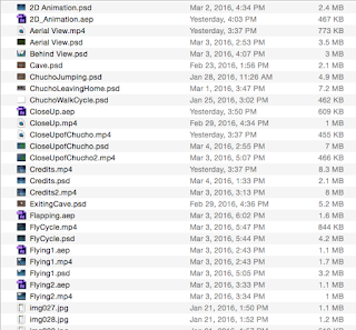
Editing I'm pretty sure one can assume that took awhile, especially in a file with multiple test renders, different animating styles, and even scenes that I had to cut to fit the time period allotted to me. There was well over fifty individual files within the Chucho folder I placed within my desktop, but I brought all of the frames together in After Effects, uploaded a cut version of the soundtrack, and did about 50 seconds of the 1:24 that the song actually was. After six rendering attempts, the project was complete, and I loved this cute little animation. "The Midnight Flight." was the best animation I had ever done before. 

What I learned

I learned about the fundamentals of animating in Photoshop, the benefits of After Effects, how to animate from first person POV, and even how to make a character look like they're flying. Basically, the entirety of the animation was new to me and I enjoy that it was so successful! I couldn't have done it without the assistance of Madison Redmond, Hannah Fales, and Hanna Brady; who helped me make better decisions while animating the project, like having a first person POV in the first place. If I had to do anything different, I would make animated leg movements for when Chucho was flying to make it look more natural. I would keep the type of scenes the same, but add more outlines and define characteristics for the animation background and character. I hope I can make my next animation smoother and better for next time, as well as improving my hand drawn skills for animation. I hope that next time, I can put more Disney-esque influence into the animation, like the old cartoons from the 20s, as I loved those when I was a kid. But I hope to continue down this road of improvement!