The Entry
This animation would be the first time I would try my absolute best to get a Pixel at eMagine, I decided when the concept first came to paper. This would be the animation where I could show off what I've been learning for the past two years, and where I can finally show people that this is the career I want to follow. Chute, this small green dragon, would become my personal Mickey Mouse.
The Story Behind the Animation:

Chucho's story began as a sketch within a sketchbook, a single doodle that soon grew into two, then ten, and then a hundred different drawings of this same character. I just knew that I had to bring him to life, as he was the first character I kept drawing repeatedly. So I found an animation online called
Reversal of the Heart, an animation revolving around dragons that I took inspiration from. The details of some scenes are actually my attempts to do the creator of Reversal of the Heart's own style of detailed backgrounds. So I decided that this animation, that I would hand draw frames and walk cycles and tests, would be a simple concept. This little dragon would wake up in his cave and decide to got out in the peaceful night in order to take flight, therefore, ' A Midnight Flight.' I had always liked hand-drawn styles better than 3-D, despite the benefits given to 3-D animators. I also attempted to put in influence from Lilo and Stitch into my animation due to that movie being the reason I want to animate in the first place.
Beginning


It took a week to think of some good storyboards that would pass along to be able to show the scenes I wished to bring to life. So began the attempts of doing plenty of drawings and sketches and tests in order to ensure that everything I wanted to do was doable. Every movement of Chucho was hand-drawn, from his wing movements to his walk cycle to even his ability to blink. The colors of him came from the
Slytherin logo from Harry Potter, which I thought would be not only a cool spin on the classic 'dragon', but a nice little Easter Egg of the preferred house I would be in if I were in the Wizarding World (Unfortunately I'm a Hufflepuff). I created this in Photoshop, painted and drew the backgrounds within the program, some of the animation was done in After Effects, such as the moving when Chucho is flying. The music I gained from Youtube from a game named
Ori and the Blind Forest, which i loved playing and felt that this track sounded like it would fit when the animation was made.
 Editing
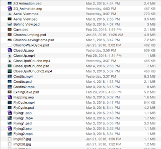
Editing I'm pretty sure one can assume that took awhile, especially in a file with multiple test renders, different animating styles, and even scenes that I had to cut to fit the time period allotted to me. There was well over fifty individual files within the Chucho folder I placed within my desktop, but I brought all of the frames together in After Effects, uploaded a cut version of the soundtrack, and did about 50 seconds of the 1:24 that the song actually was. After six rendering attempts, the project was complete, and I loved this cute little animation. "The Midnight Flight." was the best animation I had ever done before.
What I learned
I learned about the fundamentals of animating in Photoshop, the benefits of After Effects, how to animate from first person POV, and even how to make a character look like they're flying. Basically, the entirety of the animation was new to me and I enjoy that it was so successful! I couldn't have done it without the assistance of Madison Redmond, Hannah Fales, and Hanna Brady; who helped me make better decisions while animating the project, like having a first person POV in the first place. If I had to do anything different, I would make animated leg movements for when Chucho was flying to make it look more natural. I would keep the type of scenes the same, but add more outlines and define characteristics for the animation background and character. I hope I can make my next animation smoother and better for next time, as well as improving my hand drawn skills for animation. I hope that next time, I can put more Disney-esque influence into the animation, like the old cartoons from the 20s, as I loved those when I was a kid. But I hope to continue down this road of improvement!
 a review


