Showing posts with label Graphic Design. Show all posts

Monday, May 18, 2015

Step Right Up, See the Amazing Circus...Boxes!

Welcome to Cirque de Lecture!

For the final project of Graphic Design, we had to decide to make a box for a product for children. So, after discussing for a few minutes, we unanimously decided to design a package that  had something inside in which all three of us had as children, stuffed animals! So Katie Arpin, Danielle Sleigh, and myself wanted to do something clever while boxing the stuffed toys. But then Katie asked us if we had seen the Animal Crackers circus box design. We looked it up, and it was a wonderful design of a circus boxcar with animals peaking out through barred doors. We decided that it would be perfect for a children's toy box! The color palette would be yellow, red, and blue, as the primary colors are both simple, and fun for children to look at. The animals we chose to have boxes are the wolf, the fox, and the lion. We chose the three in order to show variety of the animals, not just doing circus animals for our box. So we got to work immediately!
The Fox
The Lion
The Wolf

Designing a Logo

So my job on the project was to create a lion logo for our circus. So I looked up old circus posters of lions, and decided to do a lion in profile. I chose the orange and yellow, as children recognize the form of a lion in cartoons from these designs. I checked in with my friends on the design, and they agree that its simplicity was admirable about it. The wild mane of the lion was designed with the pen tool within Adobe Illustrator, creating a new shape, then combining it with the shape constructor tool. So the three of us kept consistent tabs on ourselves so no one strayed from the goal of designing the project with glee. Danielle designed the box die lines, bleed lines, etc. Katie worked on the actual look of the box on the outside. We finished early, so we decided to add bars that are see through bars in the box, and even added a silhouette of each door of each animal on the back door. 
3-D render on Illustrator
We test rendered it and it looked beautiful, but the print was messed up due to the print shop messing with the size of our box. but we pulled through, with our cooperative skills enabled and we believe it was beautiful!


Afterword

This final project and last hurrah for graphic design I believe went beautifully. My friends and I designed a realistic, beautiful box that could look like it belongs on store shelves. I would change the logo a tad, but all in all, our work I believe is exemplary. I will continue to carry on the legacy of the graphic lessons I have and use them in my animations. This year's been great and I can't wait for more!


Friday, May 15, 2015

Fixing Fonts

Fonts that I make

This font is one I've used before, Young Shark, and one I love using do to the interesting look it has. But there are other ideas I've had for it. Merging the letters and making a completely different look to it was my mission. So I went into Illustrator to type out my name. I made all of them a compound path while adding and subtracting points within the font. I merged the V with two "S"es, The J with the L, and made a dragon-esque tail for the I. I also subtracted the extra fins from Young Shark, as they were getting in the way of my style. Now I can create my own fonts.

Afterword

Even though what I did was minimal, I loved what I did. I just can't wait to do more with making my own fonts. Hopefully they can be really nice on future projects.

Thursday, May 14, 2015

Thinking WITH The Box.

The name of my made-up company

Creating with Products.

Graphic designers do business with those who need help displaying their brand across to be viewed by the potential customers.  They have to be beautiful, simple, elegant, and even memorable. This week we learned how to create an entire style with making package designs for made-up products. Mine was named Wyvern, a company that produced genetic altering medication that led one to grow their own natural wings, bat or bird.  So I set off to complete the task at hand, making a well -constructed,  interesting concept to carry out.

The Process

I began working on the box outline, die line, and bleed line by using the shape tool, pen tool to create other shapes to construct a box. I then used the shape combiner tool to create the complete, whole outline of my box. I then set up a color palette to see which colors would work well with my company. I knew I wanted a blue, to coincide with my theme of skylines and clouds, but needed a color to contrast and complement it by itself.  So watching lynda.com tutorials, I found a nice shade of purple that symbolized royalty and even magic. Afterword, I found a beautiful font called Head Case that seemed as imaginative and innovative like my product. But editing with the 'y' in Wyvern, I found that I had warped it to be an interesting dragon shape. So I kept the design as my main logo for the company.  By then, I had amassed enough pictures to make the 3-D revolve, which was one of the hardest to accomplish due to the repeated problems I had making them, from the wonky bottle to the box not being copied, meaning that I had to create ANOTHER box just to showcase the opposite side. But I pushed through and endured through the trying tasks, and my final project turned out beautiful.


Afterword

I felt that my box was original, and it inspires me to continue pursuing my designing skills even when I finish graphic design. The troubles were even fixable, and I can't wait to end the year on a high note.


Sunday, April 19, 2015

Imagine eMagine

The Classy Red Carpet Affair for Midwestern High Schoolers

eMagine excitement

eMagine is a film and art festival designed to celelbrate the Midwest's up and coming arts and film students. Displaying the best of the best, it is undoubtedly one of the best perks of being an e-Communication student. You get a nice evening out with your classmates, you see their hard work, as well as get inspired to improve your own, and you get experience of professionalism that one may see in the future. This contest is one of the better ways to ensure at least some are willing to go an extra mile to put in excruciating details into their work, in high hopes to win the top prize and get recognition for the hard work they had put into their projects. This event is one in which everyone within e-Communication gets excited for. eMagine just so happens to be the biggest contest for high schooler-run media in the area, with about 20 schools sending in the best of their best. Olathe Northwest has hosted eMagine ever since the school's opening, with each year getting larger with more fantastic entries than the years previous. This year being no exception. Last year, I vowed to enter in my own work for at least a shot of being in the finals. I myself entered in four of my own projects I was proud of into eMagine, but lost out to some who were better experienced than I was. Even still, I couldn't wait for this event, especially knowing many of my friends had made it to the finals!

The Night to Remember

I had gotten a nice dress for the occasion, knowing it was meant to be treated like a junior Oscars, with a classy feel as well as nice occasion. I went with my sister, who didn't get a chance to last year. As soon as I got there, I met up with my fellow friends within e-Comm and sat near the front within the middle section. So I got really good seats to watch, without any hindrance in my way. So we all watched everything from hilarious Christmas music videos to serious news packages, from my friend Katie Arpin placing 3rd in her entry to watching my friend Shona winning the animation category. I enjoyed myself and got inspired to do more, wishing I could one day be in the running for a Pixel (the award given out at eMagine). But this year, I was happy to be a spectator to the talent of my peers. Watching these videos reminded me of why I joined e-Communication almost two years ago. Of the talent that develops from our teachers' instructions, and I realized how much I've improved due to their tutelage. So now, I'm anxiously already brainstorming ideas for next year, finding ways to animate with better quality I've ever had been before.

Animation

I believe that the animation section was brilliantly made and well done over the night, with the third place "Floating Islands" animation inspiring me, as well as the flowing smooth animation of the Dragon. The winners deserve their awards and I believe that the videos and animations were placed in the correct place.

Graphic Design

The graphics were executed with such grace and beauty that I'm impressed to see that it was made by high schoolers. My favorite of the night was my friend Katie Arpin's with her design for Amelia Earhart, as I saw her working on it, and it was brilliant.  Her skills were exemplified easily and I hope to see her improve next year!

Video

The videos were well made, well produced, and kept me entertained and entranced the entirety of the night. But the one I loved the most was the "Christmas Vacation" video, as I laughed the entire time it was playing, it flowed smoothly, and the script was brilliant. I wish that we did a video like that as like a group e-Comm video for school, cause then everyone will have so much fun making it!

Web

I never realized the complexity of the websites until I saw the finalists. each one had its own unique flare that I found both inspiring and admirable. The "as Though Lost" website was so simple, and elegant in its own way. I looked at it later and couldn't believe students created it! Well done, my fellow e-Comm peeps!
Afterwords
Honestly, one of this year's highlights was eMagine, cause it gives me a broader perspective of my peers' achievements and work. It also gives me ideas on how to approach my own, not giving up and doing the best I can to start animating like I want to do professionally. This gives me the ambition I need to further enhance my skills, and maybe one day win eMagine like I've dreamed of. But I first have to learn even more skills than I already know. So, until next time friends!

Afterwords

Honestly, one of this year's highlights was eMagine, cause it gives me a broader perspective of my peers' achievements and work. It also gives me ideas on how to approach my own, not giving up and doing the best I can to start animating like I want to do professionally. This gives me the ambition I need to further enhance my skills, and maybe one day win eMagine like I've dreamed of. But I first have to learn even more skills than I already know. So, until next time friends!

Friday, March 13, 2015

How To Train Your Poster

ReImagining Saul Bass

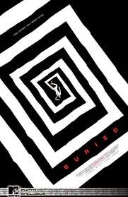
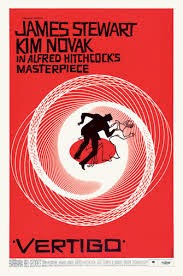
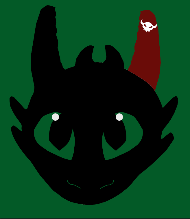
Saul Bass was an artist who brought about a new age of designs with his posters, using minimal effects and colors to bring about the true meaning of a film. He had done posters such as the ones like Vertigo and Buried, as well as many more. Inspired by his artistic, original style, I decided to make my own poster. It just so happened to be one partaining to a story of friendship between a dragon and a Viking. It was How to Train Your Dragon.


The Idea Taking Flight


 Of course, there were to be trials and different designs that immediately sprang up when this project first blossomed. I had ideas to just have a fire made up of flying dragons with a single viking helmet within the hoard. But then I settled in on Toothless, one of the major icons of the franchise, wearing a viking helmet and staring ahead towards the viewer, his pupils the symbol from Hiccup's armor. I went forward enthusiastically, enjoying and creating different visual effects on Photoshop after scanning in my drawings. Yet I found problems with the design after word. Toothless's jawline was lost among the rest of his body, the Viking Helmet had too many colors, and the pupils detracted from the overall feel of the poster. So I scrapped the idea of just using his head and a viking helmet, and decided for a full body shot, minus his tail. There were too many, in my opinion, posters of just the tail. So I took away the tail. So I used the pen tool to create the body and the wings. I then colored the left ear, leg, and wing red, the color of the prosthetic of Toothless by the end of the movie. It symbolizes that even when you lose a vital part of yourself, there can be someone or something to help make you whole.
So using and manipulating the body and outlines I traced, the entire poster seem to pop. So all I needed was a text to announce which movie it was. So looking on http://www.1001freefonts.com, I discovered a very Viking-esque type font that seemed just as rugged as I could ever hope for. So I looked up the release date and the list of lead roles, I typed them in. It looked so contrasting with the black of Toothless's body. Happy and thrilled, I saved my final draft and am now proud to show off my Saul Bass Inspired poster.

Afterword

I do believe this is one of my best projects. I enjoyed the progress, yet I feel like I would change the type perhaps, with something I made. But I am really in love with this poster. I hope that Mr. Bass could be proud that I took inspiration from him! 'Til next time!

My Poster
Saul Bass's Poster

Thursday, March 5, 2015

Inspiration of a Poster

The Top Ten Things that Inspire Me:

The Main Idea

There are inspirations that drive us all. Ones that make us happy to push to beyond the limits set by our peers. Mine drove me to even make the decision to go into the e-Communication program. Deciding that making a classy poster to honor the objects that keep me continuing on through this long trek called high school, I went into it with enthusiasm, but also with hesitation. Making these kinds of projects are always making me strive for perfection, yet with a deadline, it was difficult.

The Process

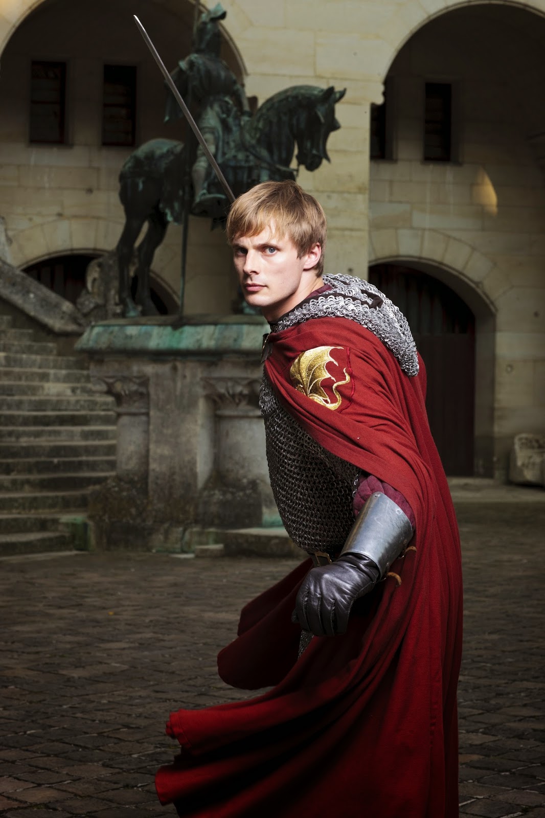
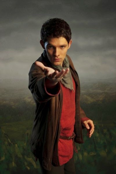
The entire project was brought to life by InDesign, yet another program created by Adobe that helped me achieve my masterpiece. I used a ruler tool to map out what would go where, and also being inspired by a style of an article from a magazine, involving text curving around pictures and everything perfectly split into two separate sides. I found pictures from the internet for common objects I loved, such as the Panic! at the Disco Photo, the posters for How To Train Your Dragon and Lilo & Stitch, the laptop, and the British TV show collage. I edited each photo within Photoshop to either increase clarity or to combine different photographs into one. Example being, the collage of British TV shows. I had taken separate photos of each of the shows I loved and brought them together to make one big conglomeration of my favorite shows, with my favorite characters at the helm. 
Then using InDesign's multi-fillable box tool, I placed the boxes within the grid I laid out, to be filled with text or pictures. I used the place tool to then put my edited photos into the poster, which by then had started to come together quite nicely. The only issue then was creating the several different type styles. Using the text styles box, I created three different styles, one for titles, one for the curving texts, one for the titles. I made sure to edit the colors to make them visible among the dark pictures as well as being able to be seen among the lighter colors. I then placed the text into the different fillable boxes. Finally, I warped the text into different curves so to parody that previous style I had seen.


 Reflections

I believe I could have done the text a bit better for the curving, as well as a better color, but I believe I did a good job for the first time attempting a new type of program such as InDesign. I loved the pictures, especially the one I edited from the British TV shows. I wouldn't change a thing with an exception of the type palettes used. I hope to use this knowledge when need comes for it again, maybe making a movie poster. I can't wait for more!

Tuesday, December 16, 2014

You've got Mail!

The Postcards

Meaning of Postcards

Postcards have been around for centuries, bringing people closer to their loved ones by displaying some of the positive aspects from the places being visited. So to actually bring my own personality and put it into a postcard truly made me ecstatic! I could make who I am and what's inspired me thus far into a visual art to be enjoyed by others. 

The Method of the Making

I truly got inspired for my Postcards due to my fascination with Christmas and the merriness that embodies the entire holiday with an air of cheer and happiness. So I directed that focus to my work. I created 3 postcards, one of which is a Christmas card made for the holidays. Utilizing Morguefile.com for a resource to use photographs that can be easily altered, I found a Reindeer picture that would be perfect for making this card. I then gathered a variety of others, like ornaments, lights, and a gingerbread man, to put together into a coherent embodiment of the holidays. I used layer masks to color the reindeer's nose into a bright red, and used layer masks to erase the outside edge along each photo I gathered. Finding then a beautiful snowy scene with pine trees, I decided to edit the background image to have a greenish hue, to both contrast with my objects and to show the natural beauty of pine trees. Finally, I had words in red and added a gradient to have white slowly overtaking the red in the word colors, like a candy cane.


Link to Morguefile.com

http://www.morguefile.com


 My own Personal Postcard

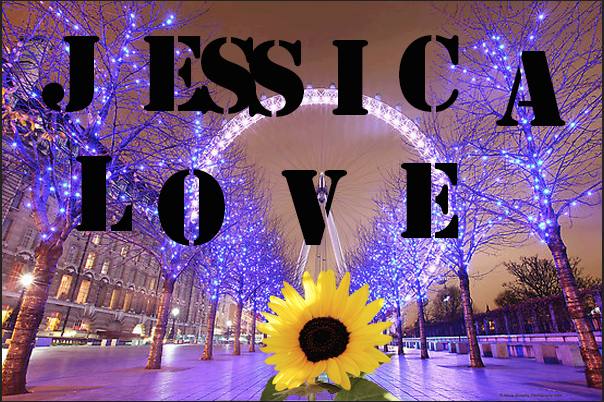
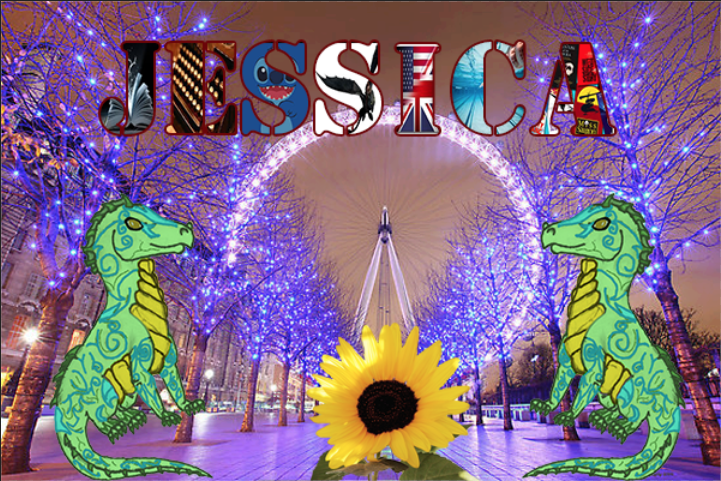
I had always wanted to visit London, as the place I've always imagined it should be entices me. I love the beautiful country it is, I love how some of their shows inspired me to go into e-Communication, and their similar yet diverse culture from ours.
So when asked to do a personal card embodying myself, I had to include pictures of London, along with some of my own work, like this dragon to the right. But I remember where I came from, the land of Sunflowers and Crazy Weather, so in the middle of that London street I wish to someday walk, I put a Sunflower to remind me of my roots. Each letter of my name has an aspect of myself that I am proud that has stayed with me throughout my lifetime. It shows that I love reading, writing, that I'm a swimmer, love plays and productions, and that one day I wish to work as an animator, making movies like Lilo & Stitch or How to Train Your Dragon for other children to enjoy. 


Testing the Waters

This last postcard was my first introduction to the postcards, making my last name into a work of elegance and beauty. I had found the same picture of London as earlier, but found my favorite shade of blue. So, I used four pictures that define me in my life currently, that I'm a wondrous, curious person, who loves British things and who loves to read and write. I used layer masks to put the pictures into each letter, and then put a stroke on each to highlight them against the background. 

 Afterword

I'm proud of my own assignments, and they are beautiful in a way that they represent myself. I wouldn't change much, but the only thing I would would be the colors of some of the highlights. But I loved them, as they could help me make Christmas cards for my family in the near future. I hope to learn more as the new year shifts ever closer...

Saturday, November 22, 2014

In the Shadowed Path

Casting Shadows

Link to Morguefile.com:
http://www.morguefile.com/


This project was used to learn how to create a shadow for an object inserted into a picture in Photoshop. I obtained both photographs from the website Morguefile.com. After downloading both of the files, I opened them in Photoshop. Using the quick selection tool, I quickly took the leopard out of it's original photo in order to get the leopard by itself. But still, there was a faint outline of the original background. Using the Defringe tool to eliminate this annoying pixel fringe-like halo, I was finally left with the Leopard alone in a transparent background. I then copied the layer of the Leopard in Photoshop, and used the warp tool to shape the duplicate layer into a shadow position. Gradients were then used to create the dark to light contrast within the shadow. Finally, I lowered the transparency of the shadow so there could be showings of the background layer peeking through the silhouette of the Leopard.
Along the way, I learned how to warp duplicate pictures into shadows just by using a warp tool to make it look like the shadow is natural. Also, gaining the knowledge about how the project can be used, like to make a book cover or a poster look realistic.
I loved the resulting picture, but next time I would swap out the picture of the Leopard to do a different animal, so as to see how they would compare to my completed project. Yet I would keep the background picture, as I feel it is a perfect picture to practice inserting other animals into.
For future projects, I would use the shadows for making realistic photo alterations. Like attempting to create a poster for a movie I saw. In general, I believed this project to be a fun and great success, and I am excited for future endeavors utilizing new skills acquired by the actions needed to fulfill the requirements for this project.

Monday, November 10, 2014

The Love-ly Isle of Dracon

The Love-ly Isle of Dracon


The Floating Island entailed learning about extracting pictures and eliminating the pixel fringe around the image so you could combine several pictures together to form an entirely new photo. Using Photoshop, I extracted the island from a photograph of an island off a beach. I then embedded it into the cloud photo used behind. Taking a copy of both pictures, I copied them and made the copies darker so it has a dramatic feel to the photo. I then selected a cloud and copied it in front of the image of the island, to make it feel like the island wasn't just pasted in front of a picture. Along the way, I found out how to copy a selected portion of the isle to create a point at the end of the island to make it look like a spire.
Finding dragon pictures on the internet, I embedded them into the picture to make them look like they're flying around my floating island. I found out how to cast their shadows on the clouds by using a dark brush tool set to a low opacity. Finally, I used a picture of stars, set the picture in front of all of the others, and then used screen lighting to get rid of the black space and leave the stars as snowflakes blowing in the air. All in all, I loved the project, as I got to exploit some of my creativity. But one thing I would change if I could would be the type of dragons I chose for this project, as they were not the easiest to embed. Yet the snow I would keep, as it makes me feel like my project stand out among my peers'.
Perhaps in future projects I would be able utallize the abilities to take out photos and combine them in different ways so I could create things like book covers or posters. I truly enjoyed this project and hope for more like this to come in the near future.


Tuesday, November 4, 2014

Sphere Projects

Sphere Projects


Shiny Earth Tutorial Link:
http://design.tutsplus.com/tutorials/create-a-shiny-earth-with-photoshop-3d-layers--psd-4838
Glowing Layer Sphere Link:
http://design.tutsplus.com/tutorials/quick-tip-create-a-colorful-sliced-sphere-to-use-as-a-logo-design--vector-4087


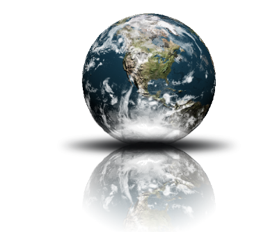
Spheres represent the world, how large it could be and how small at the same time. How it feels both safe and unique. Spheres can also mean the entirety of province or domain of an object, like how AT&T's spherical logo represents their worldwide coverage. I created two different spheres for Illustrator and Photoshop, a glowing sliced sphere from Illustrator and a 3-D Earth reflection from Photoshop.
The work for both Illustrator and Photoshop was relatively smooth, little to no problems from the exception in Photoshop to try and get a cloud layer to connect with the 3-D earth. But in Photoshop, it was easier to create a 3-D look, accomplished by wrapping a photo around a sphere, to apply the shadows and drop shadows to each layer, and to change and redo the aspects of each sphere.
In Illustrator, the effects was much more detailed, the glowing effects looked more natural and beautiful, and the sphere looks vivid and lively compared to Photoshop's.
I learned something different for each tutorial, to create a light, glowing feel to objects in Illustrator, and how to create cool 3-D images in Photoshop by making a picture wrap around a 3-D figure to create a cool effect.
But I do want to learn about how to create other 3-D objects in Photoshop, instead of just spheres. Like how to create characters that look and feel realistic. In Illustrator, I hope to learn how to create glowing effects to other objects, like creating a neon text font.

Sunday, October 19, 2014

Invasion of the Spheres


Spheres have a strange connection to logos for a long time, from AT&T's logo to Pepsi, they show us the influence they have on the world. This week, we learned how to create a 3-D sphere on both Adobe Illustrator and Photoshop CS6. We learned how to utilize the different styles and techniques that are preformed by each program, how we can prefer one over the other, and the different ways you can make spheres in separate programs for use for a logo or whatever else is needed.
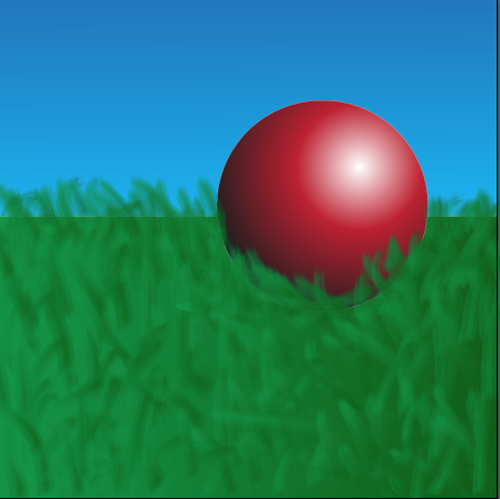
The sphere to the left was created in Adobe Illustrator using a Sphere tool and using a radial Gradient tool to make the effect of light and shadow for the sphere. We created a shadow by making the gradient from dark to light, reversing it from the gradient used on the sphere and attached the circular shadow to the bottom of the sphere to give it a shadow from the light source. For this project, I made it my own by adding grass and a sky background to show that the sphere is resting on something. However, for me at least, this program was harder to achieve because of the confusing way the gradient tool on Illustrator was. But once I puzzled out the problems to be fixed, the process afterword was relatively easy. The values of the sphere were a bit wonky to try to balance out, yet again, once you found the balance to make the sphere realistic, it could be accomplished with less work.
This sphere was created in Photoshop CS6, again using a Sphere tool and coloring the sphere with a Gradient tool. This tutorial I liked better because of the easy to follow directions and the steps were easily accomplished. But using a blur tool, you could make the sphere a bit "grainy" in a sense that it makes the sphere appear more realistic than the one from Illustrator. The Gradient tool to find the values to make both the 3-D shape and the shadow were easier to navigate through and to perfect. But to make this one my own, I made both the shadow and the sphere have a more "grainy" appearance than usual.

Thursday, October 2, 2014

The Story of a Logo

The Story of a Logo

Everything in a logo has meaning to you; the colors, type, or even the shapes we use play a part in showing the world a part of yourself. I kept the stars in my logo, as to me, they means the unknown. The uncharted territory. "The road not taken" per say. I like to see what going down that road will bring and what I can accomplish while doing so. The colors of my logo represent the personality I have, like how blue represents self expression. Or how the gold means that I like being optimistic. The font expressed how I still love tradition, but am willing to break down the old way of doing things and replacing it with stuff that I love to do and loved doing.

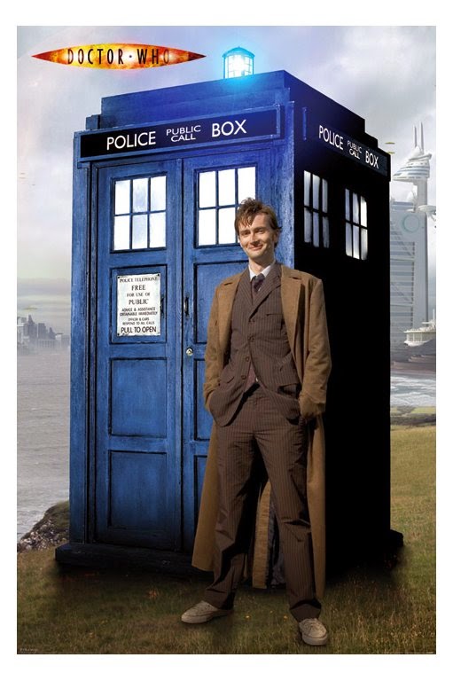
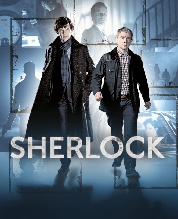
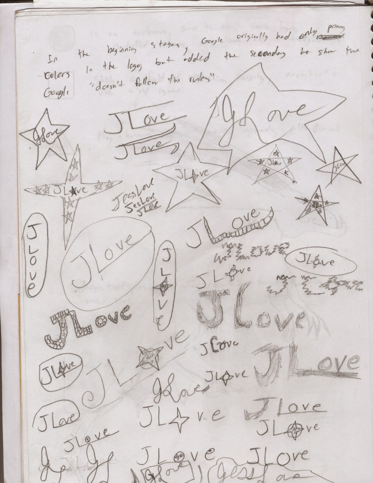
My process for developing my logo was that I made a few sketches in my sketchbook about designs that caught my muse. I was mainly inspired for some of my looks for logos by looking at fan made logos for shows like Doctor Who and Sherlock. I developed a couple logo ideas that I fell in love with. I made logos on Illustrator and soon got inspired to go freehand on the program. Then, after I got designs I liked, I started messing with the effects available on Illustrator like the Grain effect, or the Drop Shadow. Using a multitude of art boards on Illustrator, I could immediately stop work on one logo and start making another one. It did make things useful when I was struck to create the logo I really admire at the top of the page. The black star with the glowing gold letters with my name in cursive.


 I learned how to create 3-D effects by adding a drop shadow behind shapes or letters, to give an object a sort of glowing look by using a grain tool. But I do want to know how to create different animal patterns to find a logo I would fall in love with, like scales or feathers.

For what I did well, I believe that I did well with original ideas with the effects. The black star with glowing yellow letters is something I'm proud to show off as my logo. But I would do the design a bit different, maybe added a few four pointed star, as I do like the look of those better. I would also try to make the star a bluish color, as I want to incorporate my favorite color into my work.
For areas of improvement, I would do some of the shapes I made with line tool a bit smoother, as I know they weren't my best work.