Sunday, April 26, 2015

Blast to the Green Screen-y Past

Evolution of Effects

Within film, special effects were needed from the very beginning to give them the special "magical feel" that everyone is familiar with today. From the rudimentary beginnings using simple exposures to create some of the first effects to the green screen of today, innovations are always needed to make the movies even more realistic. But I needed to see the beginnings in order to fully appreciate the much more simple task of green-screening. So I decided to find some examples of the special effects that soon developed into the cinematic beauties many are used to. The main source used is from Filmmaker IQ.

The Magician's Medium

What is the Magician's Medium?

The Magician's medium is one of the first methods used for special effects, used and created by one of the first pioneers of film, Georges Méliès. Georges uses multiple exposure to create his effects, meaning he paints over some spaces in the lens of the camera and re-shoots the scenes later with the paint removed, giving more exposure to a subject rather than the background. The only issue was that films utilizing this can't go across the camera, as they would walk into areas blocked out from the paint. What came next was a solution, the "Black Screen" or also known as "The Williams Process".


The "Black Screen"

How did the Black Screen technique work?

This progress was simpler, tape actors acting in front of a pure black background, and with blanching out the film, actors were distinguished with pale, white figures while the background can be changed from anything, from previous filmed scenes to still images. The Black screen made it easy to distinguish the actors and let them move around, becoming one of the first "moving mattes" to be used in film. A famous example is 1933's "The Invisible Man" where the main actor wore all black to go with the black background and made himself "invisible" within the film.

The Dunning Process

Who created the Dunning Process?

A man named C. Dodge Dunning found issues with the Williams Process, as shadows were lost against the screen and it made the whole film seem two dimensional. So he created a method of using a blue screen to track the moving mattes of actors and used a yellow light to shine on actors, highlighting them more AND have them keep their shadows. However, this method was faulty as well, as it could only be used in black and white films well and when used in colored films due to the meddling of Lawrence Butler, there was always a noticeable blue line within the shots. The fine details of hair and smoke were also lost. So as to compensate, along came a new method, the yellow screen.

The Yellow Screen

Who owned the Yellow Screen Camera?

Yellow Screens involved actors being shot in normal light and acting in front of a blank screen illuminated by sodium vapor lights (used in streetlamps at the time used, in the '60s and '70s) it was tuned to a specific wavelength for a specific camera, nothing else would work. Disney owned the only camera in existence, which made rivals try to find a suitable counterpart to counteract Disney's superior technology. This was found with the Color Matte Difference.

Color Matte Difference

What was the purpose/technique of Color Matte Difference?

The Dunning Process was revisited and made rediscovered by Petro Vlahos (also creator of the yellow screen process) by using the old bluescreen once again. He used a "positive" (Green Cancellation process) and ran the film through a color negative and exposing both film strips together under a blue sheet to light to create a difference matte. (This is where filmmakers separate the fuzzing blue overhue from the background out.) The matte was made clearer with the blue and green lights the same amount. Then the matte was run through AGAIN using green and its opposite mask, red, to create the synthetic blue separation. This complicated process remained in popular use for about 40 years until the digital age came up.

Digital Process

Where is this used now?

This is the current form of special effect technology, and the one many are familiar with. The reason green came about was due to the fact that green was easier to light than blue, as well as cheaper. Green is brighter on computers than blue, and blue is also the color of the sky. Bright green was less common than blue overall. Other screens are still used for filming in digital today, depending on shots or movies, but green is the easiest due to the green being easier to read on camera and the mattes being easier to define due to the enhancements of digital cameras.

Thoughts

I have learned much about the history of effects, I didn't even know there were so many so early on in film! But since the industry is continually growing, effects will continue to do the same. I just can't wait to see how much more realism can be added to our movie going experience. Peace out peeps!

Sunday, April 19, 2015

Imagine eMagine

The Classy Red Carpet Affair for Midwestern High Schoolers

eMagine excitement

eMagine is a film and art festival designed to celelbrate the Midwest's up and coming arts and film students. Displaying the best of the best, it is undoubtedly one of the best perks of being an e-Communication student. You get a nice evening out with your classmates, you see their hard work, as well as get inspired to improve your own, and you get experience of professionalism that one may see in the future. This contest is one of the better ways to ensure at least some are willing to go an extra mile to put in excruciating details into their work, in high hopes to win the top prize and get recognition for the hard work they had put into their projects. This event is one in which everyone within e-Communication gets excited for. eMagine just so happens to be the biggest contest for high schooler-run media in the area, with about 20 schools sending in the best of their best. Olathe Northwest has hosted eMagine ever since the school's opening, with each year getting larger with more fantastic entries than the years previous. This year being no exception. Last year, I vowed to enter in my own work for at least a shot of being in the finals. I myself entered in four of my own projects I was proud of into eMagine, but lost out to some who were better experienced than I was. Even still, I couldn't wait for this event, especially knowing many of my friends had made it to the finals!

The Night to Remember

I had gotten a nice dress for the occasion, knowing it was meant to be treated like a junior Oscars, with a classy feel as well as nice occasion. I went with my sister, who didn't get a chance to last year. As soon as I got there, I met up with my fellow friends within e-Comm and sat near the front within the middle section. So I got really good seats to watch, without any hindrance in my way. So we all watched everything from hilarious Christmas music videos to serious news packages, from my friend Katie Arpin placing 3rd in her entry to watching my friend Shona winning the animation category. I enjoyed myself and got inspired to do more, wishing I could one day be in the running for a Pixel (the award given out at eMagine). But this year, I was happy to be a spectator to the talent of my peers. Watching these videos reminded me of why I joined e-Communication almost two years ago. Of the talent that develops from our teachers' instructions, and I realized how much I've improved due to their tutelage. So now, I'm anxiously already brainstorming ideas for next year, finding ways to animate with better quality I've ever had been before.

Animation

I believe that the animation section was brilliantly made and well done over the night, with the third place "Floating Islands" animation inspiring me, as well as the flowing smooth animation of the Dragon. The winners deserve their awards and I believe that the videos and animations were placed in the correct place.

Graphic Design

The graphics were executed with such grace and beauty that I'm impressed to see that it was made by high schoolers. My favorite of the night was my friend Katie Arpin's with her design for Amelia Earhart, as I saw her working on it, and it was brilliant.  Her skills were exemplified easily and I hope to see her improve next year!

Video

The videos were well made, well produced, and kept me entertained and entranced the entirety of the night. But the one I loved the most was the "Christmas Vacation" video, as I laughed the entire time it was playing, it flowed smoothly, and the script was brilliant. I wish that we did a video like that as like a group e-Comm video for school, cause then everyone will have so much fun making it!

Web

I never realized the complexity of the websites until I saw the finalists. each one had its own unique flare that I found both inspiring and admirable. The "as Though Lost" website was so simple, and elegant in its own way. I looked at it later and couldn't believe students created it! Well done, my fellow e-Comm peeps!
Afterwords
Honestly, one of this year's highlights was eMagine, cause it gives me a broader perspective of my peers' achievements and work. It also gives me ideas on how to approach my own, not giving up and doing the best I can to start animating like I want to do professionally. This gives me the ambition I need to further enhance my skills, and maybe one day win eMagine like I've dreamed of. But I first have to learn even more skills than I already know. So, until next time friends!

Afterwords

Honestly, one of this year's highlights was eMagine, cause it gives me a broader perspective of my peers' achievements and work. It also gives me ideas on how to approach my own, not giving up and doing the best I can to start animating like I want to do professionally. This gives me the ambition I need to further enhance my skills, and maybe one day win eMagine like I've dreamed of. But I first have to learn even more skills than I already know. So, until next time friends!

Friday, March 13, 2015

How To Train Your Poster

ReImagining Saul Bass

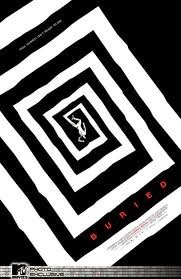
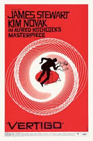
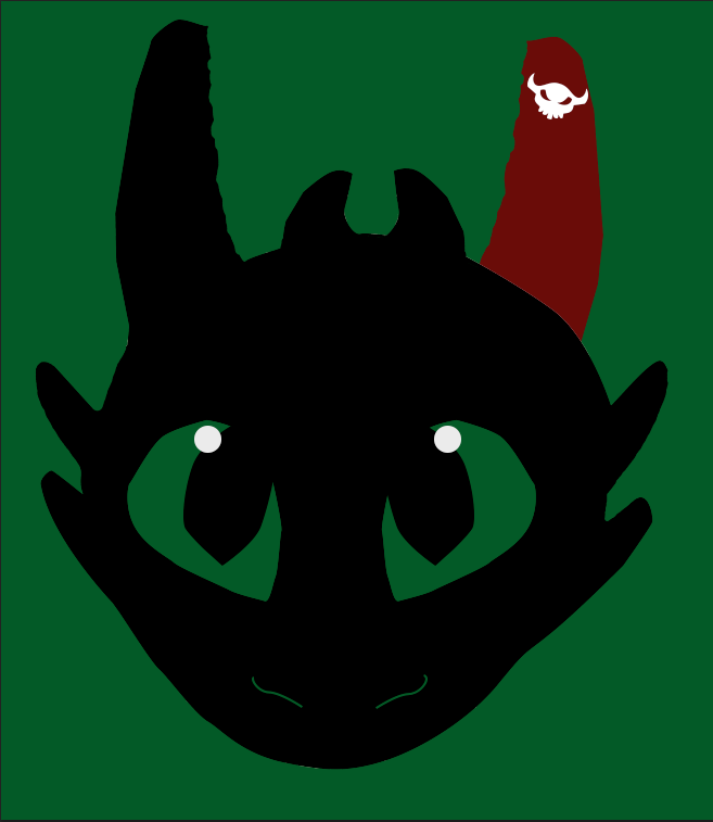
Saul Bass was an artist who brought about a new age of designs with his posters, using minimal effects and colors to bring about the true meaning of a film. He had done posters such as the ones like Vertigo and Buried, as well as many more. Inspired by his artistic, original style, I decided to make my own poster. It just so happened to be one partaining to a story of friendship between a dragon and a Viking. It was How to Train Your Dragon.


The Idea Taking Flight


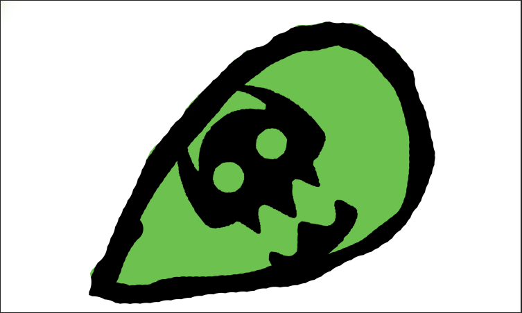
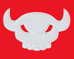
 Of course, there were to be trials and different designs that immediately sprang up when this project first blossomed. I had ideas to just have a fire made up of flying dragons with a single viking helmet within the hoard. But then I settled in on Toothless, one of the major icons of the franchise, wearing a viking helmet and staring ahead towards the viewer, his pupils the symbol from Hiccup's armor. I went forward enthusiastically, enjoying and creating different visual effects on Photoshop after scanning in my drawings. Yet I found problems with the design after word. Toothless's jawline was lost among the rest of his body, the Viking Helmet had too many colors, and the pupils detracted from the overall feel of the poster. So I scrapped the idea of just using his head and a viking helmet, and decided for a full body shot, minus his tail. There were too many, in my opinion, posters of just the tail. So I took away the tail. So I used the pen tool to create the body and the wings. I then colored the left ear, leg, and wing red, the color of the prosthetic of Toothless by the end of the movie. It symbolizes that even when you lose a vital part of yourself, there can be someone or something to help make you whole.
So using and manipulating the body and outlines I traced, the entire poster seem to pop. So all I needed was a text to announce which movie it was. So looking on http://www.1001freefonts.com, I discovered a very Viking-esque type font that seemed just as rugged as I could ever hope for. So I looked up the release date and the list of lead roles, I typed them in. It looked so contrasting with the black of Toothless's body. Happy and thrilled, I saved my final draft and am now proud to show off my Saul Bass Inspired poster.

Afterword

I do believe this is one of my best projects. I enjoyed the progress, yet I feel like I would change the type perhaps, with something I made. But I am really in love with this poster. I hope that Mr. Bass could be proud that I took inspiration from him! 'Til next time!

My Poster
Saul Bass's Poster

Thursday, March 5, 2015

Inspiration of a Poster

The Top Ten Things that Inspire Me:

The Main Idea

There are inspirations that drive us all. Ones that make us happy to push to beyond the limits set by our peers. Mine drove me to even make the decision to go into the e-Communication program. Deciding that making a classy poster to honor the objects that keep me continuing on through this long trek called high school, I went into it with enthusiasm, but also with hesitation. Making these kinds of projects are always making me strive for perfection, yet with a deadline, it was difficult.

The Process

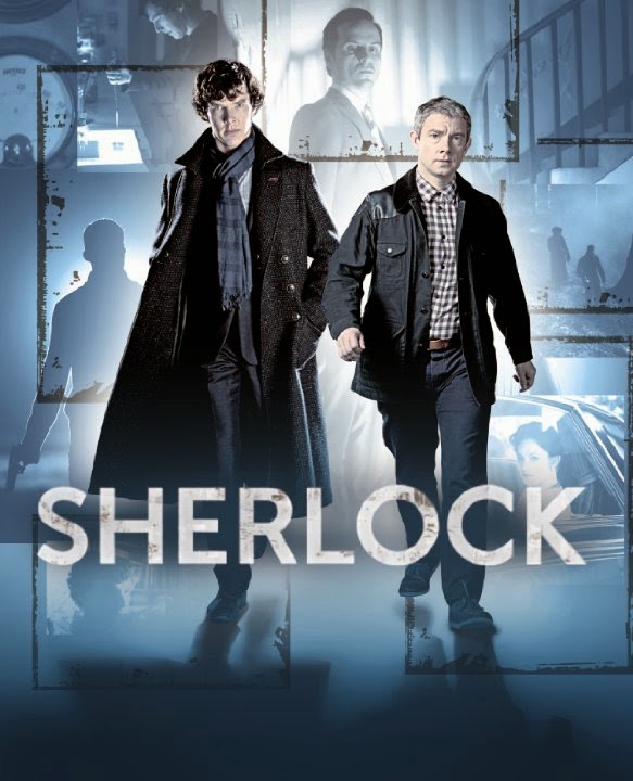
The entire project was brought to life by InDesign, yet another program created by Adobe that helped me achieve my masterpiece. I used a ruler tool to map out what would go where, and also being inspired by a style of an article from a magazine, involving text curving around pictures and everything perfectly split into two separate sides. I found pictures from the internet for common objects I loved, such as the Panic! at the Disco Photo, the posters for How To Train Your Dragon and Lilo & Stitch, the laptop, and the British TV show collage. I edited each photo within Photoshop to either increase clarity or to combine different photographs into one. Example being, the collage of British TV shows. I had taken separate photos of each of the shows I loved and brought them together to make one big conglomeration of my favorite shows, with my favorite characters at the helm. 
Then using InDesign's multi-fillable box tool, I placed the boxes within the grid I laid out, to be filled with text or pictures. I used the place tool to then put my edited photos into the poster, which by then had started to come together quite nicely. The only issue then was creating the several different type styles. Using the text styles box, I created three different styles, one for titles, one for the curving texts, one for the titles. I made sure to edit the colors to make them visible among the dark pictures as well as being able to be seen among the lighter colors. I then placed the text into the different fillable boxes. Finally, I warped the text into different curves so to parody that previous style I had seen.


 Reflections

I believe I could have done the text a bit better for the curving, as well as a better color, but I believe I did a good job for the first time attempting a new type of program such as InDesign. I loved the pictures, especially the one I edited from the British TV shows. I wouldn't change a thing with an exception of the type palettes used. I hope to use this knowledge when need comes for it again, maybe making a movie poster. I can't wait for more!

Tuesday, January 27, 2015

The Joys of Maya 3-D Animation

Maya Animation

Making a Different Type of Animation

Ever since the beginning of e-Comm, I've grown used to the joys and struggles of 2-D animation. Through Photoshop, Keynote, and even After Effects, I thought 2-D animation was the easiest and best type of animation. But recently, we've been taught our first introductions to 3-D animation. So far, it's been a fantastic time creating even more realistic animation. We've animated bouncing balls and designed realistic looking castles. I've enjoyed this very much, so now my opinion on animation has changed as well.

Polything

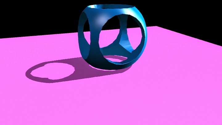
The Polything was my first attempt at learning the importance of light and shadows. I learned about ambient light, which illuminates the entire scene, but it could be manipulated to best display your creation. Spotlight is similar to that of a spotlight on a stage, where the light is a round circle that can be sharp and crisp, or gradually fade into shadows.  Point light is a tiny ball of light, that can be directed to whichever direction best suits your project. Area light surrounds an object in a circular shadow, like looking directly above your creation and seeing it's large shadow surrounding them. I learned about how important the lights and shadows can be utilized to make an object look dramatic and beautiful, or soft and delicate.  It's similar to the way graphic designers use this in movie posters to make the movie look hardcore or dramatic. I hope to enhance my abilities with this to make something really look realistic and can believably animate 3-Dimmensional projects. I do need to improve upon my usage of them, but I can tell as time went on I got better.

Hammer

Next, we learned how to make complicated objects by warping simple shapes into real-world objects, such as a hammer. I used a cut face tool to evenly cut the face of the head of the hammer to create the teeth that are used to wedge nails from the wood. I used the extrude to make the round, more circular head of the hammer used to hammer in nails, as well as making the teeth from the back. This tool then can be used to warp the faces into even more shapes. Bevel is used to warp the very vertices into either moving them to set a more natural curve, or moved into another curve. I had improved since the polishing, and am starting to make realistic projects that can be immediately recognized by the general public. I'm very happy with how quick I'm catching on and excited for the next projects upcoming. Of course, I could use the surface textures better. I am improving however. I do believe that my projects will continue to be on this up going road. 

Ice Cream

This was the first project that actually has a definite background and was meant to look realistic. This was also the first project to test out bump maps to have the natural, bumpy surface of ice cream. Bump maps can be added to give the object a 3-D texture that gives a bit more depth than regular just surface texture. Later on, I created a "lazy susan" platform to animate and make a revolving, looping and smooth transition to show off the ice cream I created.  Of course I had problems, like the ice cream parts flying off in different directions and the kinks in the animation, but eventually I overcame these small issues and I quite like this animation. I learned the importance of keeping the bump textures correct in this creation, as they can change when you render out movies. But I quite like the way it revolves and the realistic qualities of the ice cream, as it was very fun to see different designs to test out. However, I would change the Cone holding device, as I realize that it looks the least realistic out of all of the aspects, and the bowl, as I know I could've done better on some of the attributes of the bowl, like it could be a hard shiny plastic. Yet I like the final project. I am very proud of this animation.

Bouncing Spheres

I knew one day that eventually we had to create effects inspired from real life, but didn't expect it to be a throwback to my first 2-D animation, the bouncing balls. We observed the actual time it takes for the three different balls to bounce. A bowling ball, a tennis ball, and a golf ball. This was the absolute first test with animating with keynotes in Maya, a keynote being each individual frame. Observing when each ball reached their peaks and when they hit the ground, I was able to properly use small squash and stretch techniques to make them feel real. But yet problems still existed in the form of the balls slowing down due to the way the graph editor was set up. Fixing this by going into the animation edits menu, and clicking on the graph editor, I was able to find the problem and solve it. One simply has to make the stream of keynotes linear, so that the animation doesn't slow when the balls hit the ground.

The Cup

This was a new experience, even in Maya. Creating a figure drawn out in the side view by a create NURBS curve tool, then using the revolve tool to make it 3-Dimmensional. I then moved the 3-dimmensional project away, so I could warp the skeleton of the cup while seeing what it did to the actual cup. This way, I could make sure that the changes I made were for the best. By now, I had created many scenes to place my creations in, and I believe I'm getting good at it. This time, I made the reflectivity higher so it shines like metal, a gold color that boldly distinguishes it from the background, and made it basically look like the Holy Grail from the King Arthur legends. There were no problems with this project, and am excited to utilize this in the future for when I create new 3-D characters.

Salt Shaker

This salt shaker was created the by warping a circle into a strange shape and lofting a skin over top to make a 3-D figure. Lofting is when you have a shape's layout skeleton in Maya, one layer on top of the other. Then you go up into the Surfaces menu and select loft. This time, I had to create a second shape similar to my salt shaker, so that I could have salt inside the shaker.Also, I created a large cube to make a room where the salt shaker is, while adding lights and effects to make the salt shaker stand out prominently against the walls and floors. The only problems were finding the correct type of blend to find the best amount of luminosity and transparency to make the shaker appear glass, while darkening the lid and brightening the reflectivity to make the lid look like a strong plastic. The salt was created similarly like the Shaker, except scaled smaller and added a rocky texture to it, so one can see the sand sticking out. However, it came out perfectly and I couldn't be happier.


Tuesday, December 16, 2014

You've got Mail!

The Postcards

Meaning of Postcards

Postcards have been around for centuries, bringing people closer to their loved ones by displaying some of the positive aspects from the places being visited. So to actually bring my own personality and put it into a postcard truly made me ecstatic! I could make who I am and what's inspired me thus far into a visual art to be enjoyed by others. 

The Method of the Making

I truly got inspired for my Postcards due to my fascination with Christmas and the merriness that embodies the entire holiday with an air of cheer and happiness. So I directed that focus to my work. I created 3 postcards, one of which is a Christmas card made for the holidays. Utilizing Morguefile.com for a resource to use photographs that can be easily altered, I found a Reindeer picture that would be perfect for making this card. I then gathered a variety of others, like ornaments, lights, and a gingerbread man, to put together into a coherent embodiment of the holidays. I used layer masks to color the reindeer's nose into a bright red, and used layer masks to erase the outside edge along each photo I gathered. Finding then a beautiful snowy scene with pine trees, I decided to edit the background image to have a greenish hue, to both contrast with my objects and to show the natural beauty of pine trees. Finally, I had words in red and added a gradient to have white slowly overtaking the red in the word colors, like a candy cane.


Link to Morguefile.com

http://www.morguefile.com


 My own Personal Postcard

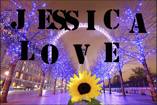
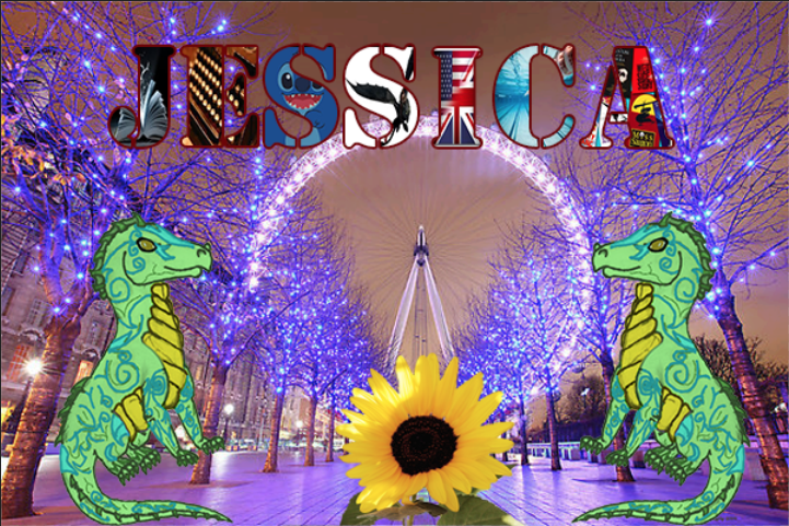
I had always wanted to visit London, as the place I've always imagined it should be entices me. I love the beautiful country it is, I love how some of their shows inspired me to go into e-Communication, and their similar yet diverse culture from ours.
So when asked to do a personal card embodying myself, I had to include pictures of London, along with some of my own work, like this dragon to the right. But I remember where I came from, the land of Sunflowers and Crazy Weather, so in the middle of that London street I wish to someday walk, I put a Sunflower to remind me of my roots. Each letter of my name has an aspect of myself that I am proud that has stayed with me throughout my lifetime. It shows that I love reading, writing, that I'm a swimmer, love plays and productions, and that one day I wish to work as an animator, making movies like Lilo & Stitch or How to Train Your Dragon for other children to enjoy. 


Testing the Waters

This last postcard was my first introduction to the postcards, making my last name into a work of elegance and beauty. I had found the same picture of London as earlier, but found my favorite shade of blue. So, I used four pictures that define me in my life currently, that I'm a wondrous, curious person, who loves British things and who loves to read and write. I used layer masks to put the pictures into each letter, and then put a stroke on each to highlight them against the background. 

 Afterword

I'm proud of my own assignments, and they are beautiful in a way that they represent myself. I wouldn't change much, but the only thing I would would be the colors of some of the highlights. But I loved them, as they could help me make Christmas cards for my family in the near future. I hope to learn more as the new year shifts ever closer...

Saturday, November 22, 2014

Stop...Hammer Time!

The Making of the Nail and Hammer

This was the first major project where I attempted to make a realistic object within Maya, in this case it was a hammer and nail resting on grass. To create the hammer, I created a cube in the center of workspace, and elongated it to about 7 times the original size and 3 times the original width. Finding the correct tools to create this, however, was a challenge as it was hard to find the right one for the correct purpose at hand. But eventually I got the hang of it as I used the face extrude tool to create the claws of the hammer and the head. I then manipulated each of the faces and reshaped them into the figures that was reminiscent of a hammer. To make the handle become smoother and more realistic looking, I selected the vertices of the middle part of the hammer handle and squeezed them closer together, and used the bevel tool on the edges to smooth them out. I then used a Lambert on the metal hammer head and raised the luminosity so it was reflective when a light was exposed to it and so it had a metallic quality and texture. Selecting then a wooden blinn for the wooden handle, I altered the appearance and color of the wood to make it fit the metal head well. I then shaped a nail out of a cylinder by extruding both the top and bottom faces of the tube, extending and stretching the bottom one into a point while the top was extruded a little, and then manipulated to have a flat, wider top. I repeated the process of the hammer head to the nail for the color and luminosity. After putting in a plane, I added a grass texture for the hammer and nail to rest on. Adding three different light sources, I added a spotlight over the hammer, and two directional lights that casted shadows over the grass terrain. It also eliminated the annoying black shadows that limited the view of my creations.
Along the way, I learned how to extrude faces and to manipulate them to look like certain creations and how to make them look realistic in the process. I also learned how balance this project when there were a few other projects I wished to catch up on. Although I am proud of my attempt, I wish I had done the hammer handle a bit differently, like adjusting the proportions. But I would keep the nail, as it came out better than I expected it would. Next Maya project I would do would include these lessons I learned, like manipulating faces and using directional lights to correctly illuminate my work.
The entire project I loved to do in general, as it was a simple, but fun task to accomplish. I hope that for our next Maya project to come that it is how to do living creatures perhaps, or maybe beginning to animate them.