Tuesday, December 16, 2014

You've got Mail!

The Postcards

Meaning of Postcards

Postcards have been around for centuries, bringing people closer to their loved ones by displaying some of the positive aspects from the places being visited. So to actually bring my own personality and put it into a postcard truly made me ecstatic! I could make who I am and what's inspired me thus far into a visual art to be enjoyed by others. 

The Method of the Making
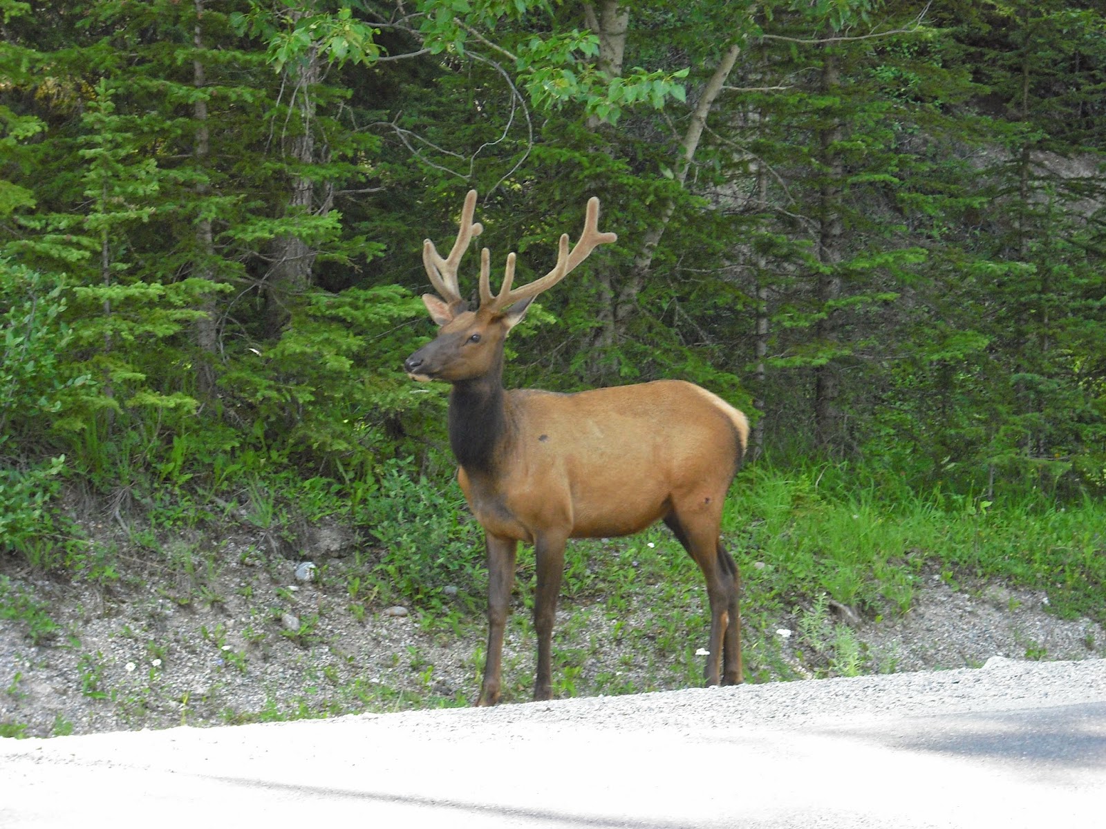
I truly got inspired for my Postcards due to my fascination with Christmas and the merriness that embodies the entire holiday with an air of cheer and happiness. So I directed that focus to my work. I created 3 postcards, one of which is a Christmas card made for the holidays. Utilizing Morguefile.com for a resource to use photographs that can be easily altered, I found a Reindeer picture that would be perfect for making this card. I then gathered a variety of others, like ornaments, lights, and a gingerbread man, to put together into a coherent embodiment of the holidays. I used layer masks to color the reindeer's nose into a bright red, and used layer masks to erase the outside edge along each photo I gathered. Finding then a beautiful snowy scene with pine trees, I decided to edit the background image to have a greenish hue, to both contrast with my objects and to show the natural beauty of pine trees. Finally, I had words in red and added a gradient to have white slowly overtaking the red in the word colors, like a candy cane.


Link to Morguefile.com

http://www.morguefile.com


 My own Personal Postcard

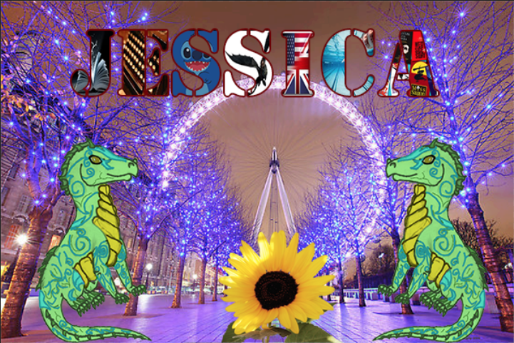
I had always wanted to visit London, as the place I've always imagined it should be entices me. I love the beautiful country it is, I love how some of their shows inspired me to go into e-Communication, and their similar yet diverse culture from ours.
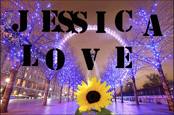
So when asked to do a personal card embodying myself, I had to include pictures of London, along with some of my own work, like this dragon to the right. But I remember where I came from, the land of Sunflowers and Crazy Weather, so in the middle of that London street I wish to someday walk, I put a Sunflower to remind me of my roots. Each letter of my name has an aspect of myself that I am proud that has stayed with me throughout my lifetime. It shows that I love reading, writing, that I'm a swimmer, love plays and productions, and that one day I wish to work as an animator, making movies like Lilo & Stitch or How to Train Your Dragon for other children to enjoy. 


Testing the Waters

This last postcard was my first introduction to the postcards, making my last name into a work of elegance and beauty. I had found the same picture of London as earlier, but found my favorite shade of blue. So, I used four pictures that define me in my life currently, that I'm a wondrous, curious person, who loves British things and who loves to read and write. I used layer masks to put the pictures into each letter, and then put a stroke on each to highlight them against the background. 

 Afterword

I'm proud of my own assignments, and they are beautiful in a way that they represent myself. I wouldn't change much, but the only thing I would would be the colors of some of the highlights. But I loved them, as they could help me make Christmas cards for my family in the near future. I hope to learn more as the new year shifts ever closer...

Saturday, November 22, 2014

Stop...Hammer Time!

The Making of the Nail and Hammer

This was the first major project where I attempted to make a realistic object within Maya, in this case it was a hammer and nail resting on grass. To create the hammer, I created a cube in the center of workspace, and elongated it to about 7 times the original size and 3 times the original width. Finding the correct tools to create this, however, was a challenge as it was hard to find the right one for the correct purpose at hand. But eventually I got the hang of it as I used the face extrude tool to create the claws of the hammer and the head. I then manipulated each of the faces and reshaped them into the figures that was reminiscent of a hammer. To make the handle become smoother and more realistic looking, I selected the vertices of the middle part of the hammer handle and squeezed them closer together, and used the bevel tool on the edges to smooth them out. I then used a Lambert on the metal hammer head and raised the luminosity so it was reflective when a light was exposed to it and so it had a metallic quality and texture. Selecting then a wooden blinn for the wooden handle, I altered the appearance and color of the wood to make it fit the metal head well. I then shaped a nail out of a cylinder by extruding both the top and bottom faces of the tube, extending and stretching the bottom one into a point while the top was extruded a little, and then manipulated to have a flat, wider top. I repeated the process of the hammer head to the nail for the color and luminosity. After putting in a plane, I added a grass texture for the hammer and nail to rest on. Adding three different light sources, I added a spotlight over the hammer, and two directional lights that casted shadows over the grass terrain. It also eliminated the annoying black shadows that limited the view of my creations.
Along the way, I learned how to extrude faces and to manipulate them to look like certain creations and how to make them look realistic in the process. I also learned how balance this project when there were a few other projects I wished to catch up on. Although I am proud of my attempt, I wish I had done the hammer handle a bit differently, like adjusting the proportions. But I would keep the nail, as it came out better than I expected it would. Next Maya project I would do would include these lessons I learned, like manipulating faces and using directional lights to correctly illuminate my work.
The entire project I loved to do in general, as it was a simple, but fun task to accomplish. I hope that for our next Maya project to come that it is how to do living creatures perhaps, or maybe beginning to animate them.

Good Kangaroo Hunting


In the midst of an Australian Outback, a hungry Dingo hides in wait for an unsuspecting Kangaroo to fall into his trap...


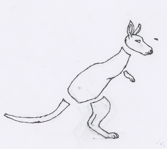
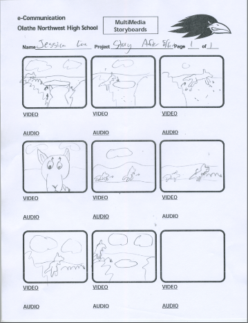
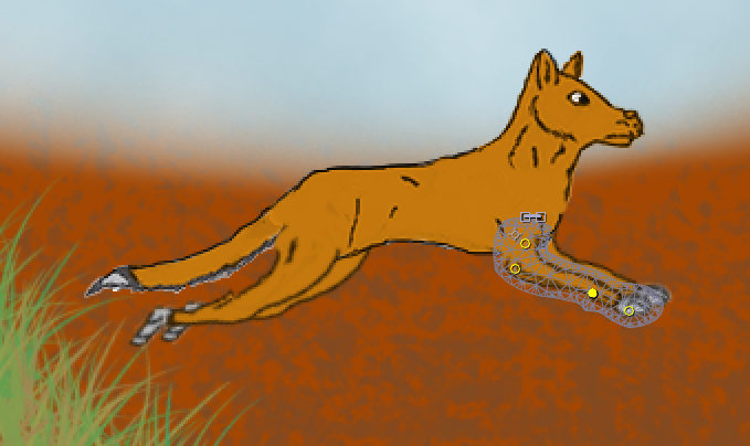
This was the first character story I've attempted this year, about a dingo hunting a kangaroo, but failing as the kangaroo speeds away. Using a combination of Photoshop and After Effects, the animation was done and done well. After drawing my two characters, the dingo and the kangaroo, I then extracted them from the paper using Photoshop and colored them accordingly. I then decorated backgrounds of the Australian Outback with a soft brush for the land and a dotted brush to create the sandy texture. I then used a grass texture to make tall and dusty blades of grass to put into the background. Transferring them all into After Effects, I then began animating each limb separately, altering the positions of the keynotes when they are needed. Then, I put in the backgrounds and placed the finished animations into each proper scene. I then created another composition in After Effects and put in the finished scenes in the correct order. Once I finished adjusting the length of the scenes, I rendered it out as an mp4.

Over the course of this story animation, I learned that how watching your inspiration of your characters can help make them better animated, and how to make a running four legged animal. I also learned about the importance of time management, as I had scenes being worked on longer than I had previously expected.
Yet even as I'm proud of my work, I still see areas that I need to improve on or change. The first would be on how to make the characters move more naturally, and maybe how to make the dingo run better. What I would change is the story, as I wish to do different animals next time. However, I do like the backgrounds I created and the characters conceived to live within them.
The experience of working four-legged animals however, is what I'll take from this project, along with the knowledge of how to make different shots of the same animation.

This was one of my favorite projects to create and to make, as I fell in love with the characters and story I made. I'm proud of my work so far and what is yet to come has me even more excited, as I know I'm improving.


In the Shadowed Path

Casting Shadows

Link to Morguefile.com:
http://www.morguefile.com/


This project was used to learn how to create a shadow for an object inserted into a picture in Photoshop. I obtained both photographs from the website Morguefile.com. After downloading both of the files, I opened them in Photoshop. Using the quick selection tool, I quickly took the leopard out of it's original photo in order to get the leopard by itself. But still, there was a faint outline of the original background. Using the Defringe tool to eliminate this annoying pixel fringe-like halo, I was finally left with the Leopard alone in a transparent background. I then copied the layer of the Leopard in Photoshop, and used the warp tool to shape the duplicate layer into a shadow position. Gradients were then used to create the dark to light contrast within the shadow. Finally, I lowered the transparency of the shadow so there could be showings of the background layer peeking through the silhouette of the Leopard.
Along the way, I learned how to warp duplicate pictures into shadows just by using a warp tool to make it look like the shadow is natural. Also, gaining the knowledge about how the project can be used, like to make a book cover or a poster look realistic.
I loved the resulting picture, but next time I would swap out the picture of the Leopard to do a different animal, so as to see how they would compare to my completed project. Yet I would keep the background picture, as I feel it is a perfect picture to practice inserting other animals into.
For future projects, I would use the shadows for making realistic photo alterations. Like attempting to create a poster for a movie I saw. In general, I believed this project to be a fun and great success, and I am excited for future endeavors utilizing new skills acquired by the actions needed to fulfill the requirements for this project.

Monday, November 10, 2014

The Love-ly Isle of Dracon

The Love-ly Isle of Dracon


The Floating Island entailed learning about extracting pictures and eliminating the pixel fringe around the image so you could combine several pictures together to form an entirely new photo. Using Photoshop, I extracted the island from a photograph of an island off a beach. I then embedded it into the cloud photo used behind. Taking a copy of both pictures, I copied them and made the copies darker so it has a dramatic feel to the photo. I then selected a cloud and copied it in front of the image of the island, to make it feel like the island wasn't just pasted in front of a picture. Along the way, I found out how to copy a selected portion of the isle to create a point at the end of the island to make it look like a spire.
Finding dragon pictures on the internet, I embedded them into the picture to make them look like they're flying around my floating island. I found out how to cast their shadows on the clouds by using a dark brush tool set to a low opacity. Finally, I used a picture of stars, set the picture in front of all of the others, and then used screen lighting to get rid of the black space and leave the stars as snowflakes blowing in the air. All in all, I loved the project, as I got to exploit some of my creativity. But one thing I would change if I could would be the type of dragons I chose for this project, as they were not the easiest to embed. Yet the snow I would keep, as it makes me feel like my project stand out among my peers'.
Perhaps in future projects I would be able utallize the abilities to take out photos and combine them in different ways so I could create things like book covers or posters. I truly enjoyed this project and hope for more like this to come in the near future.


Tuesday, November 4, 2014

Sphere Projects

Sphere Projects


Shiny Earth Tutorial Link:
http://design.tutsplus.com/tutorials/create-a-shiny-earth-with-photoshop-3d-layers--psd-4838
Glowing Layer Sphere Link:
http://design.tutsplus.com/tutorials/quick-tip-create-a-colorful-sliced-sphere-to-use-as-a-logo-design--vector-4087


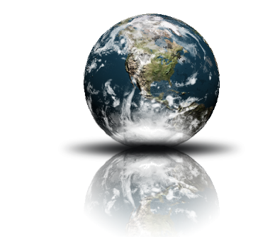
Spheres represent the world, how large it could be and how small at the same time. How it feels both safe and unique. Spheres can also mean the entirety of province or domain of an object, like how AT&T's spherical logo represents their worldwide coverage. I created two different spheres for Illustrator and Photoshop, a glowing sliced sphere from Illustrator and a 3-D Earth reflection from Photoshop.
The work for both Illustrator and Photoshop was relatively smooth, little to no problems from the exception in Photoshop to try and get a cloud layer to connect with the 3-D earth. But in Photoshop, it was easier to create a 3-D look, accomplished by wrapping a photo around a sphere, to apply the shadows and drop shadows to each layer, and to change and redo the aspects of each sphere.
In Illustrator, the effects was much more detailed, the glowing effects looked more natural and beautiful, and the sphere looks vivid and lively compared to Photoshop's.
I learned something different for each tutorial, to create a light, glowing feel to objects in Illustrator, and how to create cool 3-D images in Photoshop by making a picture wrap around a 3-D figure to create a cool effect.
But I do want to learn about how to create other 3-D objects in Photoshop, instead of just spheres. Like how to create characters that look and feel realistic. In Illustrator, I hope to learn how to create glowing effects to other objects, like creating a neon text font.

Sunday, October 19, 2014

Invasion of the Spheres


Spheres have a strange connection to logos for a long time, from AT&T's logo to Pepsi, they show us the influence they have on the world. This week, we learned how to create a 3-D sphere on both Adobe Illustrator and Photoshop CS6. We learned how to utilize the different styles and techniques that are preformed by each program, how we can prefer one over the other, and the different ways you can make spheres in separate programs for use for a logo or whatever else is needed.
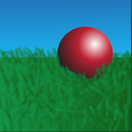
The sphere to the left was created in Adobe Illustrator using a Sphere tool and using a radial Gradient tool to make the effect of light and shadow for the sphere. We created a shadow by making the gradient from dark to light, reversing it from the gradient used on the sphere and attached the circular shadow to the bottom of the sphere to give it a shadow from the light source. For this project, I made it my own by adding grass and a sky background to show that the sphere is resting on something. However, for me at least, this program was harder to achieve because of the confusing way the gradient tool on Illustrator was. But once I puzzled out the problems to be fixed, the process afterword was relatively easy. The values of the sphere were a bit wonky to try to balance out, yet again, once you found the balance to make the sphere realistic, it could be accomplished with less work.
This sphere was created in Photoshop CS6, again using a Sphere tool and coloring the sphere with a Gradient tool. This tutorial I liked better because of the easy to follow directions and the steps were easily accomplished. But using a blur tool, you could make the sphere a bit "grainy" in a sense that it makes the sphere appear more realistic than the one from Illustrator. The Gradient tool to find the values to make both the 3-D shape and the shadow were easier to navigate through and to perfect. But to make this one my own, I made both the shadow and the sphere have a more "grainy" appearance than usual.

Thursday, October 2, 2014

The Story of a Logo

The Story of a Logo

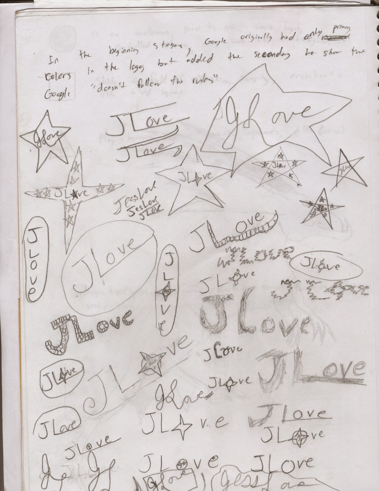
Everything in a logo has meaning to you; the colors, type, or even the shapes we use play a part in showing the world a part of yourself. I kept the stars in my logo, as to me, they means the unknown. The uncharted territory. "The road not taken" per say. I like to see what going down that road will bring and what I can accomplish while doing so. The colors of my logo represent the personality I have, like how blue represents self expression. Or how the gold means that I like being optimistic. The font expressed how I still love tradition, but am willing to break down the old way of doing things and replacing it with stuff that I love to do and loved doing.

My process for developing my logo was that I made a few sketches in my sketchbook about designs that caught my muse. I was mainly inspired for some of my looks for logos by looking at fan made logos for shows like Doctor Who and Sherlock. I developed a couple logo ideas that I fell in love with. I made logos on Illustrator and soon got inspired to go freehand on the program. Then, after I got designs I liked, I started messing with the effects available on Illustrator like the Grain effect, or the Drop Shadow. Using a multitude of art boards on Illustrator, I could immediately stop work on one logo and start making another one. It did make things useful when I was struck to create the logo I really admire at the top of the page. The black star with the glowing gold letters with my name in cursive.


 I learned how to create 3-D effects by adding a drop shadow behind shapes or letters, to give an object a sort of glowing look by using a grain tool. But I do want to know how to create different animal patterns to find a logo I would fall in love with, like scales or feathers.

For what I did well, I believe that I did well with original ideas with the effects. The black star with glowing yellow letters is something I'm proud to show off as my logo. But I would do the design a bit different, maybe added a few four pointed star, as I do like the look of those better. I would also try to make the star a bluish color, as I want to incorporate my favorite color into my work.
For areas of improvement, I would do some of the shapes I made with line tool a bit smoother, as I know they weren't my best work.

The Plausible Impossible

The Plausible Impossible is a rule for animation where the character can break the laws of nature, but only if they don't know they are doing so.


One example is when Donald's cousin, Gus Goose, is shaking his hand so hard that he is actually picking Donald up and back down again with each handshake. The plausible effect is that since Gus doesn't know that he's actually lifting up Donald, he can do it without noticing he's that strong to lift up Donald with his hand. The impossible side is that no one can not notice that they are lifting someone up with a handshake. The fact that makes this believable is that some people, when receiving a handshake from a larger person, you feel like you're being bounced.


In the same clip, Gus is putting together sandwiches like he's shuffling a deck of cards. The reason it seems plausible is the effective sound effect that goes with the scene. Also, there's the fact that both the meat and the bread can be bent like cards, it could be possible to shuffle them. But it's impossible to do so as flawlessly as Gus does it. The reason behind it is that the bread and the meat could be as stiff, or bondable, as playing cards.


Later in the same scene, we see Gus having the bread and meat be thrown into his mouth at one time and swallowed in one bite. This is plausible because some people believe that they can stuff so much food in their mouths that they can eat even whole meals in entirely one bite. But this is impossible for Gus to completely eat the entire sandwich in one mouthful. The reasoning, that no one's mouth can hold that much food.

The fourth example I have found is Gus knitting a pot full of pasta noodles into a giant sock. This seems to be plausible to some audience viewers. Since yarn is similar to size and shape to noodles like these, that they can be knit together. Yet, another impossibility, as noodles are too soft and they aren't together in one giant noodle, they are in individual pieces much too small to make an entire sock out of them.


The final example I found in this clip of Donald and his cousin Gus is when Gus uses a straw to suck up all of the peas from a plate from the opposite side of the table, and that the train of peas can twist and turn easily. This is plausible, as if you are up close to peas, and you use a straw to suck the air around them, you can suck up the peas as well. So the reasoning, is that it must work far away as it does up close. But this is impossible, because the suction from the straw can't reach as far away as they depicted in the cartoon. Also, the peas can't swerve in a line like ants, as they are inanimate objects that can only be moved with a constant stream of air pulling them towards the straw.

Monday, September 29, 2014

Tutorial for Calligram in Illustrator

My calligram for Illustrator was to make the letters of my last name look like a dog. Using a combination of small, half opaque strokes of the paint tool, it made the letters look like they had different colored fur running down their sides.

I then followed the instructions to create the dog nose, whiskers, tail, and the claws for the paws. I made these using the pen tool and coloring them in with the paintbrush tool.

I learned how to make the calligraphy on photoshop seem like it has fur, to make drop shadows to make it look like the letters are floating, to create 3-D effects by using the pen tool to outline some of the features like the tail and dog nose.

I did well with the fur and to make it look like it was flowing in a certain direction and to have a bit of shading to the fur.

What I could do differently is to improve the quality of the nose, as it was difficult to make the nose look realistic.


I want to research how to make scales next for my next lesson in Illustrator. That way I could create maybe a scale-like look for my personal logo.  I love animals and I feel inspired by them, so I feel like the should be a part of my logo.

http://design.tutsplus.com/tutorials/create-a-furry-calligram-in-illustrator--vector-3965

The Moving Landscape

I utilized the effects of Photoshop, using a blur tool to blur the colors in the night sky and a variety of brushes with added effects such as luminosity to make the stars and the moon have a hint of a glow in the background. I added dog-like creatures to howl at the moonlight. I used a thin brush to try and make thin, nimble, creepy trees and used a chalk-like brush to add the spotted textures to the trees and a transparent dark grey to add in the shadows.
Then, once I uploaded it to After Effects, I moved each layer over at different time rates to make sure that each layer moves at it's own pace. I then used the Puppet Pin tool to make the three dogs howl by moving their snouts up and their ears back. The challenge mainly for this animation was to correctly time the moving of the backgrounds. But I am proud of what I did to make this look beautiful and I'm proud to say this is my own animation.

Monday, September 22, 2014

Google Logo

The logo of Google


The original logo of google had only primary colors planned out to be featured inside the letters in a repeating way, but the "l" in Google was changed to a secondary color to set the stage that Google "doesn't follow the rules". The text is a simple Catull font, with a serif that makes the lettering look elegant and simple. It was first created in 1998, with the logo starting out similar as the present day version, with only color alterations and a much flatter look to the logo. But as time continued and the company expanded into the global icon it is today, the colorful, simple logo has lodged itself into the history of the internet. Now, the logo is nearly unchanged in comparison from past to present.

Friday, September 12, 2014

My Own Drawn Animation

My Dragon Animated


The Drawing

My character is a bipedal dragon with large wings, horns, and spines. I designed it like this to show my own spin on the classic dragon. I've always imagined dragons with two arms and two legs, large curved horns adorning the top of its head, and bat-like wings enabling it to fly.   

The Keyframes


There were a few issues of my character, as I forgot to close off shapes when I first uploaded my drawing, so getting each body part to different layers in Photoshop took a while. I also drew my character on the side, so I had to manually go back into Photoshop and use the rotate tool to shift the images over to the right side up. With Keyframes, the only issue that occurred to me on After Effects was the timing for when my character moved forward. So, by widening my workspace to show frame by frame, I shifted my character across the screen and paused it when the character's legs weren't moving.
Using a variety of different methods, including the Puppet pin tool, Move tool, and Rotation tool, I was able to have my character flap his wings, move his arms, have him walk, and have him nod his head. Pausing the animation every few frames, I copied and pasted repetitive motions for the legs to move naturally, and having them pause if one leg was already moving. The arms, I had moving up and down, using a combination of the Rotation tool and Move tool. I again copied and pasted the keyframes to have the arms move up and down. I had each step take about 15 frames with a couple frames break to show that the character is naturally walking.


The Actual Animation

Three things I learned to have my character walk is that you can copy and past keyframes so you don't have to do every single frame by hand, that you can rotate and move different parts of a character's body at the same time, and that you can resize your animation by making a new composition in After Effects.
An issue that I had making my character walk was to correctly time the keyframes and the actual movement to a reasonably believable way. I had to stop and pause the animation as soon as the foot was first moving up and out to walk and whenever the foot began to touch the ground once again, but after a few trial and error tests, I had done it well.
If I could redo it, I would change my walk to a more natural looking walk. Like the character is real enough to actually walk like a normal person instead of simply moving his legs up and down repetitively.
Even though I would change some of the techniques I used in my animation next time I try this, I am very proud of my animation and how far I've come from last year as an Animator. I'm glad I finally accomplished bringing something I drew and created by myself to bring it to life.


Thursday, September 11, 2014

Anatomy of a Font

This week, we learned about the anatomy of different fonts. We took tests to see which font best suited ourselves and complemented our personality. Mine is a font called Young Shark. Utilizing the line and text tool from Illustrator, we were able to type our name using the font that complemented us best, color it, and draw lines to indicate where some of the anatomy was.
The way my font described me was that I was emotional, understated, progressive, and disciplined. For emotional, I believe in something "feels" right. Understated for me is that I do like doing things subtle, and effectively. Progressive ideas are what I love, new ideas revealed at the time they're conceived. I was disciplined in the sense that I could be patient and work through things I don't nessesarily like in order to reach something I want.
I learned that the spine of an S is the main curve of the S, and that a stem is a straight, vertical stroke in a letter. It was difficult trying to learn what some of the differences were between similar anatomies, like between a bowl and a counter. But I luckily found the difference, (Bowls are enclosed spaces in a letter, while counters aren't closed). And I finished my Anatomy.

Thursday, September 4, 2014

My Inchworm!

My First Character Animation
I started using After Effects much better to animate this little inchworm and background I started in Photoshop. Using the Puppet Pin tools, I had my worm's torso move up and down like a real worm. Then using a Null Object to direct the movement of my worm, I had it pause between lifting its body and lowering its body to create the effect to look like it's a bit like a real worm. Lastly I copied my worm and flipped it around 180 degrees, blurred, and darkened the copied worm to look like a shadow on the grass. I actually thought I did well on this project! The worm looks like it's moving realistically and well! The challenge was to make the shadow, as I was having a difficult time making the shadow move in equal time with the worm. But using the link tool in After Effects, the shadow trails alongside the worm perfectly.

Friday, August 29, 2014

Projects from Illustrator

 This is my creative project that I created from Adobe Illustrator. It was meant to have two complementary objects, so I chose the Wolf and the Moon. I used a variety of different brushes, colors, and shapes to create the picture show to the left. I was proud to see what turned out from this project and to make it look appealing to my friends and to myself as well.
This pencil project was a continuation from a tutorial we had over the week on how to create a pencil in Illustrator. I used references from activities I like doing, books I've read, and shows that I've loved. I used multitudes of colors to try and make the project pop and look as fun as I imagine it would be. It's the type of pencil I would enjoy writing with!
This was from the tutorial I took at the beginning of the week. I am proud to get this relatively easy compared to other projects I've done in the past. Illustrator could actually be more fun than expected!

Tuesday, August 26, 2014

Animation!

Animation is really fun and has been a blast to be a part of! To see something that you created come to life, even if only for a few moments, is an amazing feeling. To start off, I recently animated a small ball bouncing happily across the screen. On Photoshop, we used just a basic up and down motion repeated in the timeline to look like it was bouncing, then rendered out the video. After Effects, I was able to create a much more refined, and realistic bounce. Using a combination a squash and squish effect, that made the ball look a bit more realistic. The challenges for this project were to actually getting the squash and squish effects in the right place or the right time. To find the right frames to squash and squish took a bit longer than expected, but was immensely satisfying to see it come to life. There was also the path for the ball to bounce, to get it looking realistic was a difficulty, but once I got the groove of it, the process became easy and even a little exciting!
It makes me wonder what other animators felt like, watching their first creations toddle across a screen. Were they just as excited and proud? When Walt Disney saw Mickey Mouse on screen for the first time, did he see all the dedication and time that he put into it? It certainly does for me! Even if this was only for a second, the rest of the year has me excited and pumped for more! 

Monday, August 18, 2014

Graphic Design to Me

Graphic Design is using words, colors, and/or pictures to show a message you want others to see.


The book cover for the special edition of "Eragon" and "Eldest" by Christopher Paolini 
 It's an art of beauty that varies from person to person, and that it conveys a multitude of feelings the artists have into their stunning displays that are one-of-a-kind. It is so enveloped and integrated into our lives that sometimes, we don't even know that every day we see someone's design or logo that's on everything from book-covers to billboard, from t-shirts to movie posters. Graphic Design is something that is as boundless and free as yourself, and it helps express your feelings or thoughts to the world.
Poster for the National Theatre Live's production of "Frankenstein" based on Mary Shelly's book with actors Benedict Cumberbatch and Johnny Lee Miller.