The Story of a Logo
 Everything in a logo has meaning to you; the colors, type, or even the shapes we use play a part in showing the world a part of yourself. I kept the stars in my logo, as to me, they means the unknown. The uncharted territory. "The road not taken" per say. I like to see what going down that road will bring and what I can accomplish while doing so. The colors of my logo represent the personality I have, like how blue represents self expression. Or how the gold means that I like being optimistic. The font expressed how I still love tradition, but am willing to break down the old way of doing things and replacing it with stuff that I love to do and loved doing.
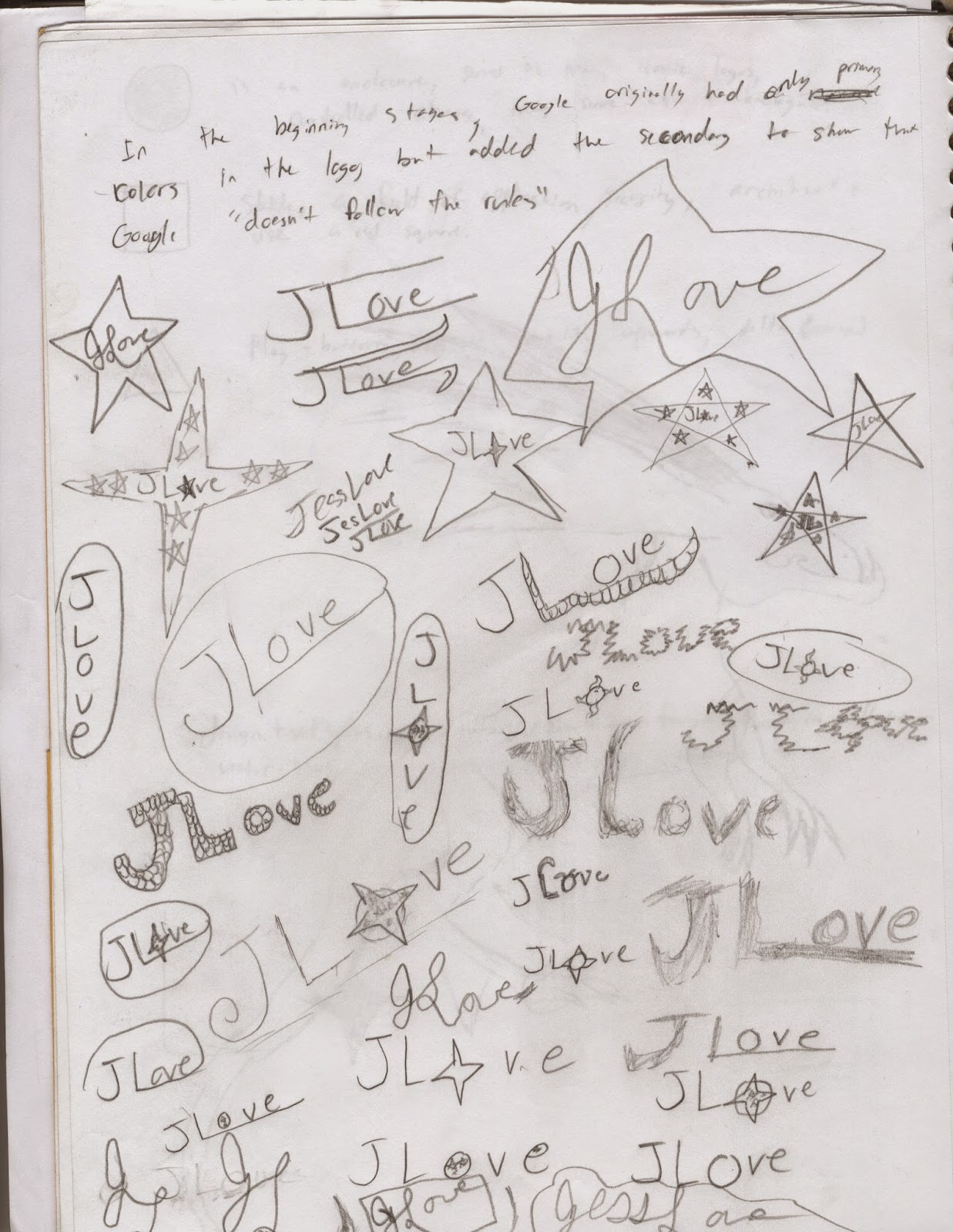
My process for developing my logo was that I made a few sketches in my sketchbook about designs that caught my muse. I was mainly inspired for some of my looks for logos by looking at fan made logos for shows like Doctor Who and Sherlock. I developed a couple logo ideas that I fell in love with. I made logos on Illustrator and soon got inspired to go freehand on the program. Then, after I got designs I liked, I started messing with the effects available on Illustrator like the Grain effect, or the Drop Shadow. Using a multitude of art boards on Illustrator, I could immediately stop work on one logo and start making another one. It did make things useful when I was struck to create the logo I really admire at the top of the page. The black star with the glowing gold letters with my name in cursive.
I learned how to create 3-D effects by adding a drop shadow behind shapes or letters, to give an object a sort of glowing look by using a grain tool. But I do want to know how to create different animal patterns to find a logo I would fall in love with, like scales or feathers.
For what I did well, I believe that I did well with original ideas with the effects. The black star with glowing yellow letters is something I'm proud to show off as my logo. But I would do the design a bit different, maybe added a few four pointed star, as I do like the look of those better. I would also try to make the star a bluish color, as I want to incorporate my favorite color into my work.
For areas of improvement, I would do some of the shapes I made with line tool a bit smoother, as I know they weren't my best work.


Thanks for sharing Jessica. I appreciate the hard work, effort, and passion you have for your projects. I was going to suggest a stroke on the outside of the star to frame it in but after reading your story I believe that would tend to nail down something you want to stay open. Also, thank you for responding to the work of others with the same passion.
ReplyDelete