Monday, December 14, 2015

Reaching for the Stars

Making the 'Star' of the show


This semester was my first major animation project, to make an animation of my own design and concept in order to test the skills I'd obtained over the past two years. I originally wanted to do an entire animation about this star and its protector trying to find the little star named Sirius after he goes missing, but the scope and magnitude of the project at hand soon made me realize my dream animation would not only be wrought with difficulties, but I would only have time to rig the star completely and model the protector. I believe that was the purpose of this project was to show the difficulties that come with these freedoms I now have to make something entirely original.

Concept

I liked the cute short animations that Disney has done, with normally inanimate objects like something as big as a volcano to a small lamp on a desk. I chose to do a little star, due to the many possibilities I can make with them due to their names and characteristics. The star I made was Sirius, the dog star, which is why I gave my star small dog ears. My original protector character I gave a large, fuzzy imaginary-friend kind of character, as the animation I was going for was a whimsical fun tale that would've interested me as a child.
So I quickly drew them, put them on the computer, and modeled them within Maya. The star was simple to handle. The protector, on the other hand, was challenging. I had originally had fur on his character, with a bunny-like muzzle. Yet the fur tool on Maya was difficult for me to use and couldn't even utilize correctly. So, in a heavy heart, I scrapped the idea for a simpler design of stripes down the sides and arms for him. The protector had a skeleton like that of the star in order to make him move. Using the bone tool, I constructed a custom bone structure for Arcturous (the protector's name), but the types of faces I used had caused problems. So, on both Sirius and Arc, I converted the faces into triangles to attempt to get them to move properly, yet even as I painted weights upon the character, it still didn't move correctly without issue, so I had to abandon my story altogether, with me quickly replacing it with a walk cycle completed for Sirius. I toon-shaded him using the toon color tool within Maya, made him look like a cartoon, and quickly finished the little star walking within the vastness of space. The rendering went without a problem, for once, and I ended the animation in about 49 frames of animated walk cycle.

Lessons Learned

I not only learned abilities to follow specific tutorials within Maya that I hadn't discovered earlier, but I learned how to put in fur within 3-D animations. It was a simple matter of creating an X-Gen file within an animation within Maya, select the type of fur that one would want (custom or premade), and apply it to certain faces upon the character. Getting advice from my peers is something entirely to me, but it surely did help, for when I got stuck within a creative rut, one of them would point out a flaw that could be corrected simply, or even a new idea that helped push me past my stubborn wants for my own animation. They helped me see the flaws within my own work and learn to be more critical of my work. Lastly, I had learned much about the importance of modeling and pre-planning animations, as I went into this animation preparing to learn on the fly and wish to make something good based on ideas made on the fly. I have since been reminded to always plan out what I want to happen within the animation, otherwise I will get lost and lose inspiration from an animation I previously had loved from the beginning.

Same? Different?

I would honestly change the protector's design to closely relate to my star and make it look like he belonged in the same animation with Sirius. The design colors as well, as even some of my peers noticed that the blue stripes down the sides looked similar to those from Tron. But I would keep the concept and the star. I loved everything about them, despite their own individual difficulties I had with them at first.

Epilogue/ Sirius' Last Bow

Generally, this project seemed more of a wake-up call of the difficulties of animation more than anything else. But I did like this project nevertheless. Despite my misgivings about the fur tool, the complete redesign of what I planned to do, and my protector character not working properly, I am very proud of what I worked on throughout this entire semester. I decided for my next project within Maya that I will design them after I had drawn out what I want with them, and that they'll fit the layout design I've planned to make them with. Already, modeling for it is easier the second time around. Perhaps maybe I'll learn to use the fur tool this project, but the skeleton and mesh are much easier to move now that I've considered how my new character will move. I loved this project, as it helped me assure myself to be the best animator that I can be, despite all the misfortunes that may occur. I hope that in the future I will retain the knowledge I have and add to this ever increasing plethora of animation knowledge. Using the new information I learned from this project, I will make my next animation even better.

Sunday, October 11, 2015

The Sweet Tune of Animation

Main Melody (Main Idea)

With the (then current) success of Frozen's soundtrack, it was about the successful nature of many new animated films, such as the Happy album from Despicable Me 2, or Immortals from Big Hero 6. It was about how the soundtrack can make or break a film, how the soundtrack can give the animated feature a new life, and how it can make a movie more popular than anticipated.
The author was arguing mainly for how the music within Disney movies, (as well as some from other companies) can make a film rise to Stardom, the prime example being that of how the new film Frozen's soundtrack outselling the record holder Lion King. He also uses prime examples that are both support that the music can make more money for a movie, like Snow White for it's revolutionary music that set the precedent for all future Disney musicals, to the time where test audiences wished for a completely new track in Pocahontas. He has backed up his sources using other interviews from both Disney employees and DreamWorks as well. However, the main weak point for this argument is that they don't discuss any of the repercussions for bad soundtracks. But another, smaller weak point is that it doesn't focus on any movies abroad, like say Wallace and Gromit, whose soundtrack is phenomenal with the movie. Yet there are several strong points in her claim, by using well known examples and success stories, as this will resonate with a broader audience. There is also the fact that she explained some of the success by using quotes from the directors of some of these films. Her conclusions being that the movie industry is booming with the new advancements and brilliant compositions of music within the film.
I do believe that the argument is important, as the movie industry with all of its advancement from the first animated feature or cartoon with sound, have come to expect pieces that match the story's feel and emotions perfectly. If a film is not up to par with the score, the entire piece, no matter how moving or emotional, will feel off and leave audiences dissatisfied. The evidence seems to be convincing, and I do not see any wide range of ramifications to be made to the argument.
The applications of an animator is that we have to be sure that if we do choose to have music, that it must fit the animation, and it can make or break a movie. But yet what I don't understand is what the author meant by it was odd to hear about how "...it was still considered unusual to make a song-heavy animated film.[in 2006]", as I had thought that other animated features were influenced heavily by its music before that, such as Lion King or Beauty and the Beast.
But now using this knowledge, it helps me realize the importance sound can give a viewer, about how music can help make or break the success of an animated feature. If I were to make a great animation, it is only fitting to have correct score in it as well.


Keegan, Rebecca. "Animated Movies Sing a Happy Tune." Los Angeles Times. Los Angeles Times, 19 Apr. 2014. Web. 11 Oct. 2015.

Thursday, September 3, 2015

The Burning Review: Sintel

F

The Story of Sintel:

Plot

Sintel was a very young redheaded girl. She was homeless and alone until she first saw a baby dragon injured in the dirty streets. Being a kind soul, she takes in the little infant, cares for his injuries, and become very close that she gives him the name of Scales. But one day, when the tiny hatchling was flying on his newly healed wings, a large, unidentified dragon swooped in and kidnapped Scales, leaving Sintel determined to find him and bring him home. Her journey leads her into the cold mountains, deep into dragon territory. There she hopes to be reunited with her long lost companion.


Sintel. Blender Foundation, 2010. Film.

Design/ Focus

Sintel's art style is a 3-D animated movie created in Blender, with detailed features on the main cast, while some of the background characters don't seem to have as much development. An example of this is when Sintel was fighting a thief near the beginning of the animation, her movement just seemed more fluid to me than her adversary. The backgrounds seem to be animated in 3-D as well, unlike some animations in 3-D that I've seen. My Maya animations looked to have similar shadows with the lights like they were. However, the facial features on the humans seem similar to Maya's as well. They weren't flawless, but well made for an independent film made by recent college graduates. Some of the fight scenes at the end, between Sintel and a dragon, weren't as smooth as some of the other fights. But the story endured, and seemed beautiful on its own.

Reviewing Sintel

The emotions of story itself was enduring, at times peaceful, cute, and even a tiny bit tender. But the personalities from the main characters was there in all its beautifully rendered glory. The design for all of them were fantastic and their movement so varied and different depending on their own personality. But the tale being told of how a woman has dedicated her life to search for her friend in spite of the risks and difficulties presented to her was illustrated by at first having her fight an enemy, and then having a flashback to explain the backstory. A mini montage of Scales healing and growing closer to Sintel was mastered perfectly by holding the camera above Sintel's bed and slowly turning around on an axis, with each night Scales growing closer until they are next to each other.
Myself, I would take some of the character development and design with me if I were to work inspired off of this animation. The characters just looked so right with the personalities given to them. I would also take the smooth flying scenes of when Scales and the opposing dragon are flying, as I've wanted to animate a flying animal in Maya for quite some time now. I am grateful that I have learned how to make backgrounds with similar texture, as if I hadn't, creating projects like this would be much harder and more tough to do.


What the Creator did Well: Sintel was full of very vibrant animations of dragons, a chicken chase, and animating so many people at nice in a marketplace scene. Development of the story through the use of light tones and lights for the fond memories that Sintel had of Scales, while the darker pictures later on showed the dark side of the animation. Very well used technique for this short film to showcase the feelings of the protagonist in the intensity and/or brightness of the light.

What Could He Improve: The walk cycles and the water animations could be more fluid, as at times it felt as if the spilt liquid on the floor was just a shape being pulled over a plane. Character walks at times can be stiff, and even rough in a few places. Example is when Sintel was fighting the adult dragon, the dragon's movements looked fine, but it seemed like that  Sintel's were a tad slower than what they should've been.

Concluding Thoughts:

All in all, I loved this animation to bits, not because I love Fantasy, but the simple, yet eloquent story that seemed to stem so easily from this animation. The characters, their designs, the backgrounds, all of it compliments each other nicely. Besides a few minor flaws, the animation seems to be a fantastic rendering of the bond of friendship and how far it can go to save a friend. It wasn't as overly spectacular as How to Train Your Dragon, but was animated just right to be wonderfully enduring.

Link to the Video:

Sintel


Monday, May 18, 2015

One Small Step for Me, One Giant Project to Handle

The Hype of Animation Finals!


       Within Animation, we learned much from this past semester of fun, trial, and error. So, for our final animation project of the year, we decided that since Jessie Blom, Greta Lundy, and I worked so well before, we combined our forces once again to bring forth the best of our capabilities in our own respective way. We immediately got to story boarding our final piece. But finding a concept was difficult to do, as we wanted to be as creatively free as possible, but still have at the very least, a hint of the plot. We threw around ideas, nothing really sticking until Greta comes up with the idea of a visitor on an alien world. Our group loved it, Jessie even saying that the encounter should be with a robot. The creative process truly started when Greta sketched out a basic plot from our idea, and we then got to work instantly. Greta would animate and create the robot, I would create the opening title card, and Jessie would wrap the whole thing together. It would be hard to do, as it encompassed our entire semester of learning into a single project. But again, it was to show off the skills we acquired from the semester, and it was an ambitious, fantastic feeling of pride when we put ourselves to work. So we set out to complete our goal, displaying the best of our capabilities to a single, coherent idea that was just as creative as we were.


The Process Begins!


        After being introduced initially to the tutorials of Video Copilot and seeing how detailed and simple they could be, I discussed with my partners on what type of sequence would be used. Would it be mysterious, foreboding, magical? But in the end, there was a tutorial on a grid looking sequence, robotic and calculating. After seeing the entire overall look of the piece, I knew it would be fantastic. So, having a cool lightning effect within Adobe After Effects and editing it to look like a grid layout, duplicating the layers, and having them fade in and out was the first step, simply achieved by utilizing the many positive aspects of After Effects. But then the second step emerged, having the letters emerge from a moving, 3-D background. I had never done this before. So, I converted all of the layers into a 3-D layer like the tutorial said to do. However, the effects kept creating problems within After Effects. They slowed down rendering with each one I added, and even changing one detail within the keyframes of my work caused it having to be re-rendered to even see if it would work. But then, I discovered the perfect looking grid fad-in that I stuck with for our title sequence. But since we had extra time as I finished, I chose to use a fade out effect on the text layer and I believe it turned out fantastic. Greta had used Maya to create the stunningly beautiful robot. Jessie had made the background in Photoshop and brought the whole thing together with After Effects. We had finished before the deadline of May 19th, so we enhanced our effects and made them better with mine taking more time with the fade out effect, and Greta added more fluidity to her robot. We managed our time well, I believe, as we had enough time to enhance the effects and footage we had rather than attempt to cram everything at the last minute. I've actually had to render out my project 3 different times to make sure I got everything right.
The Robot

Afterwords and Last Words


         This entire year was full of firsts, exciting and new animation skills being awakened as well as the high point of my creativity. I loved what I've done this past year, my animating skills have greatly improved and I've done things I've never thought of before. Green screens and After Effects and 3-D animating has me excited at the endless possibilities available to me now. Although I love the project as it is, I would change the color of my grid effect, to match the robot a bit more. I also would want another idea to attempt, maybe have someone live with the robot like a sitcom. Or one idea I wish we had done was to have the video go a bit longer, and have a different encounter with a creature be highlighted. But I did enjoy creating the grid effect itself, so that part would stay the same. I also enjoy the look of the robot, and how it moves, so I would retain those things as well. But one thing I would keep the same about this project is the people I was with to create this project, as it wouldn't be good without Greta or Jessie. I will draw out some of the effects from After Effects, like the lightning to help make better looking openings. Perhaps I will find the other effects and make my own original openings. I also want to experience the 3-D converter in After Effects, as it was an interesting thing to try and succeed at. I hope that next year will bring more excitement and thrills to the field and help me achieve my dream of being an animator at Disney.

The Pictures of my Time as an Invader:)


The Ring
Poking at Air


Confuzzled me

Step Right Up, See the Amazing Circus...Boxes!

Welcome to Cirque de Lecture!

For the final project of Graphic Design, we had to decide to make a box for a product for children. So, after discussing for a few minutes, we unanimously decided to design a package that  had something inside in which all three of us had as children, stuffed animals! So Katie Arpin, Danielle Sleigh, and myself wanted to do something clever while boxing the stuffed toys. But then Katie asked us if we had seen the Animal Crackers circus box design. We looked it up, and it was a wonderful design of a circus boxcar with animals peaking out through barred doors. We decided that it would be perfect for a children's toy box! The color palette would be yellow, red, and blue, as the primary colors are both simple, and fun for children to look at. The animals we chose to have boxes are the wolf, the fox, and the lion. We chose the three in order to show variety of the animals, not just doing circus animals for our box. So we got to work immediately!
The Fox
The Lion
The Wolf

Designing a Logo

So my job on the project was to create a lion logo for our circus. So I looked up old circus posters of lions, and decided to do a lion in profile. I chose the orange and yellow, as children recognize the form of a lion in cartoons from these designs. I checked in with my friends on the design, and they agree that its simplicity was admirable about it. The wild mane of the lion was designed with the pen tool within Adobe Illustrator, creating a new shape, then combining it with the shape constructor tool. So the three of us kept consistent tabs on ourselves so no one strayed from the goal of designing the project with glee. Danielle designed the box die lines, bleed lines, etc. Katie worked on the actual look of the box on the outside. We finished early, so we decided to add bars that are see through bars in the box, and even added a silhouette of each door of each animal on the back door. 
3-D render on Illustrator
We test rendered it and it looked beautiful, but the print was messed up due to the print shop messing with the size of our box. but we pulled through, with our cooperative skills enabled and we believe it was beautiful!


Afterword

This final project and last hurrah for graphic design I believe went beautifully. My friends and I designed a realistic, beautiful box that could look like it belongs on store shelves. I would change the logo a tad, but all in all, our work I believe is exemplary. I will continue to carry on the legacy of the graphic lessons I have and use them in my animations. This year's been great and I can't wait for more!


Friday, May 15, 2015

Fixing Fonts

Fonts that I make

This font is one I've used before, Young Shark, and one I love using do to the interesting look it has. But there are other ideas I've had for it. Merging the letters and making a completely different look to it was my mission. So I went into Illustrator to type out my name. I made all of them a compound path while adding and subtracting points within the font. I merged the V with two "S"es, The J with the L, and made a dragon-esque tail for the I. I also subtracted the extra fins from Young Shark, as they were getting in the way of my style. Now I can create my own fonts.

Afterword

Even though what I did was minimal, I loved what I did. I just can't wait to do more with making my own fonts. Hopefully they can be really nice on future projects.

Thursday, May 14, 2015

Thinking WITH The Box.

The name of my made-up company

Creating with Products.

Graphic designers do business with those who need help displaying their brand across to be viewed by the potential customers.  They have to be beautiful, simple, elegant, and even memorable. This week we learned how to create an entire style with making package designs for made-up products. Mine was named Wyvern, a company that produced genetic altering medication that led one to grow their own natural wings, bat or bird.  So I set off to complete the task at hand, making a well -constructed,  interesting concept to carry out.

The Process

I began working on the box outline, die line, and bleed line by using the shape tool, pen tool to create other shapes to construct a box. I then used the shape combiner tool to create the complete, whole outline of my box. I then set up a color palette to see which colors would work well with my company. I knew I wanted a blue, to coincide with my theme of skylines and clouds, but needed a color to contrast and complement it by itself.  So watching lynda.com tutorials, I found a nice shade of purple that symbolized royalty and even magic. Afterword, I found a beautiful font called Head Case that seemed as imaginative and innovative like my product. But editing with the 'y' in Wyvern, I found that I had warped it to be an interesting dragon shape. So I kept the design as my main logo for the company.  By then, I had amassed enough pictures to make the 3-D revolve, which was one of the hardest to accomplish due to the repeated problems I had making them, from the wonky bottle to the box not being copied, meaning that I had to create ANOTHER box just to showcase the opposite side. But I pushed through and endured through the trying tasks, and my final project turned out beautiful.


Afterword

I felt that my box was original, and it inspires me to continue pursuing my designing skills even when I finish graphic design. The troubles were even fixable, and I can't wait to end the year on a high note.


Tuesday, May 12, 2015

The Explosive Content of Animation

To Bring Great Fun to Explosive Content

Special effects have entranced movie watchers ever since the dawn of movies, from the first wonders of people disappearing and reappearing to the new aliens of Doctor Who, and so on. This week, we got the chance to explore the beginning steps towards these brilliant effects that people often overlook, but movies can't live without.
Starting out with the basics, we were given a simple task, to make a car garage explode, with small detailed effects being placed cleverly with layer masks to make it seem realistic. Alongside special effects like glows and camera shaking, I was proud to see the final result being so well constructed from a stock footage clip from New York City. But then a challenging task became to animate a still photo. So, stepping up to the plate, I decided to do a fire pit exploding. I took similar elements from the previous project and modified them to make the picture feel like it's live action, with using keyframes to measure out glow periods, specialized effects to create realistic flames shooting from the pit, and even smoke rising out of the ashes. 
Finally, we took footage from my friend Greta Lundy and Jessie Blom opening a microwave, and having it explode. Timing the sound, compressing the footage,  and even making the camera shake in After Effects, we created a funny, short clip of my friend being blown back by an explosion. 

Afterword

These projects were used to show how easy, yet how hard it was to truly master these effects shown in even masterpiece movies such as Avengers, or Hunger Games. It makes one wish to do more, to strive to be the best they could be in their respective field of animation. I hope to continue to do we'll over the summer and discover these effects for myself.

Sunday, April 26, 2015

Blast to the Green Screen-y Past

Evolution of Effects

Within film, special effects were needed from the very beginning to give them the special "magical feel" that everyone is familiar with today. From the rudimentary beginnings using simple exposures to create some of the first effects to the green screen of today, innovations are always needed to make the movies even more realistic. But I needed to see the beginnings in order to fully appreciate the much more simple task of green-screening. So I decided to find some examples of the special effects that soon developed into the cinematic beauties many are used to. The main source used is from Filmmaker IQ.

The Magician's Medium

What is the Magician's Medium?

The Magician's medium is one of the first methods used for special effects, used and created by one of the first pioneers of film, Georges Méliès. Georges uses multiple exposure to create his effects, meaning he paints over some spaces in the lens of the camera and re-shoots the scenes later with the paint removed, giving more exposure to a subject rather than the background. The only issue was that films utilizing this can't go across the camera, as they would walk into areas blocked out from the paint. What came next was a solution, the "Black Screen" or also known as "The Williams Process".


The "Black Screen"

How did the Black Screen technique work?

This progress was simpler, tape actors acting in front of a pure black background, and with blanching out the film, actors were distinguished with pale, white figures while the background can be changed from anything, from previous filmed scenes to still images. The Black screen made it easy to distinguish the actors and let them move around, becoming one of the first "moving mattes" to be used in film. A famous example is 1933's "The Invisible Man" where the main actor wore all black to go with the black background and made himself "invisible" within the film.

The Dunning Process

Who created the Dunning Process?

A man named C. Dodge Dunning found issues with the Williams Process, as shadows were lost against the screen and it made the whole film seem two dimensional. So he created a method of using a blue screen to track the moving mattes of actors and used a yellow light to shine on actors, highlighting them more AND have them keep their shadows. However, this method was faulty as well, as it could only be used in black and white films well and when used in colored films due to the meddling of Lawrence Butler, there was always a noticeable blue line within the shots. The fine details of hair and smoke were also lost. So as to compensate, along came a new method, the yellow screen.

The Yellow Screen

Who owned the Yellow Screen Camera?

Yellow Screens involved actors being shot in normal light and acting in front of a blank screen illuminated by sodium vapor lights (used in streetlamps at the time used, in the '60s and '70s) it was tuned to a specific wavelength for a specific camera, nothing else would work. Disney owned the only camera in existence, which made rivals try to find a suitable counterpart to counteract Disney's superior technology. This was found with the Color Matte Difference.

Color Matte Difference

What was the purpose/technique of Color Matte Difference?

The Dunning Process was revisited and made rediscovered by Petro Vlahos (also creator of the yellow screen process) by using the old bluescreen once again. He used a "positive" (Green Cancellation process) and ran the film through a color negative and exposing both film strips together under a blue sheet to light to create a difference matte. (This is where filmmakers separate the fuzzing blue overhue from the background out.) The matte was made clearer with the blue and green lights the same amount. Then the matte was run through AGAIN using green and its opposite mask, red, to create the synthetic blue separation. This complicated process remained in popular use for about 40 years until the digital age came up.

Digital Process

Where is this used now?

This is the current form of special effect technology, and the one many are familiar with. The reason green came about was due to the fact that green was easier to light than blue, as well as cheaper. Green is brighter on computers than blue, and blue is also the color of the sky. Bright green was less common than blue overall. Other screens are still used for filming in digital today, depending on shots or movies, but green is the easiest due to the green being easier to read on camera and the mattes being easier to define due to the enhancements of digital cameras.

Thoughts

I have learned much about the history of effects, I didn't even know there were so many so early on in film! But since the industry is continually growing, effects will continue to do the same. I just can't wait to see how much more realism can be added to our movie going experience. Peace out peeps!

Sunday, April 19, 2015

Imagine eMagine

The Classy Red Carpet Affair for Midwestern High Schoolers

eMagine excitement

eMagine is a film and art festival designed to celelbrate the Midwest's up and coming arts and film students. Displaying the best of the best, it is undoubtedly one of the best perks of being an e-Communication student. You get a nice evening out with your classmates, you see their hard work, as well as get inspired to improve your own, and you get experience of professionalism that one may see in the future. This contest is one of the better ways to ensure at least some are willing to go an extra mile to put in excruciating details into their work, in high hopes to win the top prize and get recognition for the hard work they had put into their projects. This event is one in which everyone within e-Communication gets excited for. eMagine just so happens to be the biggest contest for high schooler-run media in the area, with about 20 schools sending in the best of their best. Olathe Northwest has hosted eMagine ever since the school's opening, with each year getting larger with more fantastic entries than the years previous. This year being no exception. Last year, I vowed to enter in my own work for at least a shot of being in the finals. I myself entered in four of my own projects I was proud of into eMagine, but lost out to some who were better experienced than I was. Even still, I couldn't wait for this event, especially knowing many of my friends had made it to the finals!

The Night to Remember

I had gotten a nice dress for the occasion, knowing it was meant to be treated like a junior Oscars, with a classy feel as well as nice occasion. I went with my sister, who didn't get a chance to last year. As soon as I got there, I met up with my fellow friends within e-Comm and sat near the front within the middle section. So I got really good seats to watch, without any hindrance in my way. So we all watched everything from hilarious Christmas music videos to serious news packages, from my friend Katie Arpin placing 3rd in her entry to watching my friend Shona winning the animation category. I enjoyed myself and got inspired to do more, wishing I could one day be in the running for a Pixel (the award given out at eMagine). But this year, I was happy to be a spectator to the talent of my peers. Watching these videos reminded me of why I joined e-Communication almost two years ago. Of the talent that develops from our teachers' instructions, and I realized how much I've improved due to their tutelage. So now, I'm anxiously already brainstorming ideas for next year, finding ways to animate with better quality I've ever had been before.

Animation

I believe that the animation section was brilliantly made and well done over the night, with the third place "Floating Islands" animation inspiring me, as well as the flowing smooth animation of the Dragon. The winners deserve their awards and I believe that the videos and animations were placed in the correct place.

Graphic Design

The graphics were executed with such grace and beauty that I'm impressed to see that it was made by high schoolers. My favorite of the night was my friend Katie Arpin's with her design for Amelia Earhart, as I saw her working on it, and it was brilliant.  Her skills were exemplified easily and I hope to see her improve next year!

Video

The videos were well made, well produced, and kept me entertained and entranced the entirety of the night. But the one I loved the most was the "Christmas Vacation" video, as I laughed the entire time it was playing, it flowed smoothly, and the script was brilliant. I wish that we did a video like that as like a group e-Comm video for school, cause then everyone will have so much fun making it!

Web

I never realized the complexity of the websites until I saw the finalists. each one had its own unique flare that I found both inspiring and admirable. The "as Though Lost" website was so simple, and elegant in its own way. I looked at it later and couldn't believe students created it! Well done, my fellow e-Comm peeps!
Afterwords
Honestly, one of this year's highlights was eMagine, cause it gives me a broader perspective of my peers' achievements and work. It also gives me ideas on how to approach my own, not giving up and doing the best I can to start animating like I want to do professionally. This gives me the ambition I need to further enhance my skills, and maybe one day win eMagine like I've dreamed of. But I first have to learn even more skills than I already know. So, until next time friends!

Afterwords

Honestly, one of this year's highlights was eMagine, cause it gives me a broader perspective of my peers' achievements and work. It also gives me ideas on how to approach my own, not giving up and doing the best I can to start animating like I want to do professionally. This gives me the ambition I need to further enhance my skills, and maybe one day win eMagine like I've dreamed of. But I first have to learn even more skills than I already know. So, until next time friends!

Friday, March 13, 2015

How To Train Your Poster

ReImagining Saul Bass

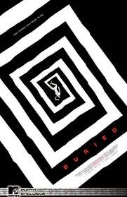
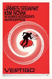
Saul Bass was an artist who brought about a new age of designs with his posters, using minimal effects and colors to bring about the true meaning of a film. He had done posters such as the ones like Vertigo and Buried, as well as many more. Inspired by his artistic, original style, I decided to make my own poster. It just so happened to be one partaining to a story of friendship between a dragon and a Viking. It was How to Train Your Dragon.


The Idea Taking Flight


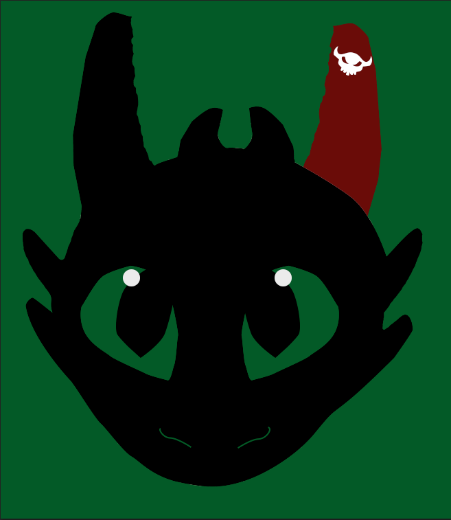
 Of course, there were to be trials and different designs that immediately sprang up when this project first blossomed. I had ideas to just have a fire made up of flying dragons with a single viking helmet within the hoard. But then I settled in on Toothless, one of the major icons of the franchise, wearing a viking helmet and staring ahead towards the viewer, his pupils the symbol from Hiccup's armor. I went forward enthusiastically, enjoying and creating different visual effects on Photoshop after scanning in my drawings. Yet I found problems with the design after word. Toothless's jawline was lost among the rest of his body, the Viking Helmet had too many colors, and the pupils detracted from the overall feel of the poster. So I scrapped the idea of just using his head and a viking helmet, and decided for a full body shot, minus his tail. There were too many, in my opinion, posters of just the tail. So I took away the tail. So I used the pen tool to create the body and the wings. I then colored the left ear, leg, and wing red, the color of the prosthetic of Toothless by the end of the movie. It symbolizes that even when you lose a vital part of yourself, there can be someone or something to help make you whole.
So using and manipulating the body and outlines I traced, the entire poster seem to pop. So all I needed was a text to announce which movie it was. So looking on http://www.1001freefonts.com, I discovered a very Viking-esque type font that seemed just as rugged as I could ever hope for. So I looked up the release date and the list of lead roles, I typed them in. It looked so contrasting with the black of Toothless's body. Happy and thrilled, I saved my final draft and am now proud to show off my Saul Bass Inspired poster.

Afterword

I do believe this is one of my best projects. I enjoyed the progress, yet I feel like I would change the type perhaps, with something I made. But I am really in love with this poster. I hope that Mr. Bass could be proud that I took inspiration from him! 'Til next time!

My Poster
Saul Bass's Poster

Thursday, March 5, 2015

Inspiration of a Poster

The Top Ten Things that Inspire Me:

The Main Idea

There are inspirations that drive us all. Ones that make us happy to push to beyond the limits set by our peers. Mine drove me to even make the decision to go into the e-Communication program. Deciding that making a classy poster to honor the objects that keep me continuing on through this long trek called high school, I went into it with enthusiasm, but also with hesitation. Making these kinds of projects are always making me strive for perfection, yet with a deadline, it was difficult.

The Process

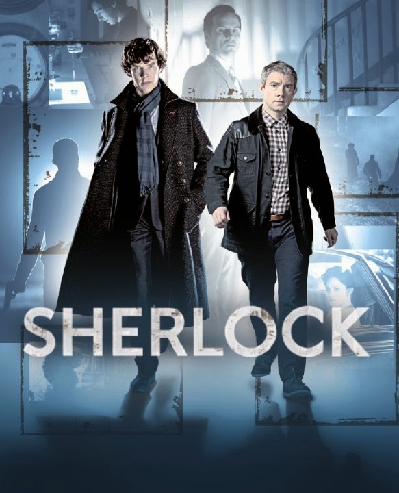
The entire project was brought to life by InDesign, yet another program created by Adobe that helped me achieve my masterpiece. I used a ruler tool to map out what would go where, and also being inspired by a style of an article from a magazine, involving text curving around pictures and everything perfectly split into two separate sides. I found pictures from the internet for common objects I loved, such as the Panic! at the Disco Photo, the posters for How To Train Your Dragon and Lilo & Stitch, the laptop, and the British TV show collage. I edited each photo within Photoshop to either increase clarity or to combine different photographs into one. Example being, the collage of British TV shows. I had taken separate photos of each of the shows I loved and brought them together to make one big conglomeration of my favorite shows, with my favorite characters at the helm. 
Then using InDesign's multi-fillable box tool, I placed the boxes within the grid I laid out, to be filled with text or pictures. I used the place tool to then put my edited photos into the poster, which by then had started to come together quite nicely. The only issue then was creating the several different type styles. Using the text styles box, I created three different styles, one for titles, one for the curving texts, one for the titles. I made sure to edit the colors to make them visible among the dark pictures as well as being able to be seen among the lighter colors. I then placed the text into the different fillable boxes. Finally, I warped the text into different curves so to parody that previous style I had seen.


 Reflections

I believe I could have done the text a bit better for the curving, as well as a better color, but I believe I did a good job for the first time attempting a new type of program such as InDesign. I loved the pictures, especially the one I edited from the British TV shows. I wouldn't change a thing with an exception of the type palettes used. I hope to use this knowledge when need comes for it again, maybe making a movie poster. I can't wait for more!

Tuesday, January 27, 2015

The Joys of Maya 3-D Animation

Maya Animation

Making a Different Type of Animation

Ever since the beginning of e-Comm, I've grown used to the joys and struggles of 2-D animation. Through Photoshop, Keynote, and even After Effects, I thought 2-D animation was the easiest and best type of animation. But recently, we've been taught our first introductions to 3-D animation. So far, it's been a fantastic time creating even more realistic animation. We've animated bouncing balls and designed realistic looking castles. I've enjoyed this very much, so now my opinion on animation has changed as well.

Polything

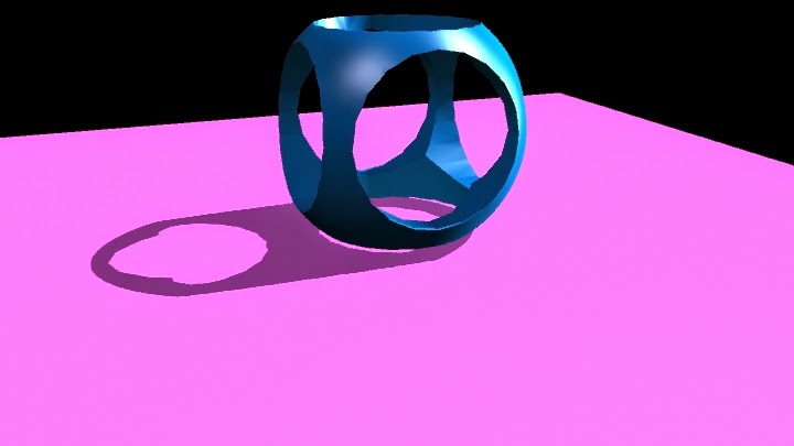
The Polything was my first attempt at learning the importance of light and shadows. I learned about ambient light, which illuminates the entire scene, but it could be manipulated to best display your creation. Spotlight is similar to that of a spotlight on a stage, where the light is a round circle that can be sharp and crisp, or gradually fade into shadows.  Point light is a tiny ball of light, that can be directed to whichever direction best suits your project. Area light surrounds an object in a circular shadow, like looking directly above your creation and seeing it's large shadow surrounding them. I learned about how important the lights and shadows can be utilized to make an object look dramatic and beautiful, or soft and delicate.  It's similar to the way graphic designers use this in movie posters to make the movie look hardcore or dramatic. I hope to enhance my abilities with this to make something really look realistic and can believably animate 3-Dimmensional projects. I do need to improve upon my usage of them, but I can tell as time went on I got better.

Hammer

Next, we learned how to make complicated objects by warping simple shapes into real-world objects, such as a hammer. I used a cut face tool to evenly cut the face of the head of the hammer to create the teeth that are used to wedge nails from the wood. I used the extrude to make the round, more circular head of the hammer used to hammer in nails, as well as making the teeth from the back. This tool then can be used to warp the faces into even more shapes. Bevel is used to warp the very vertices into either moving them to set a more natural curve, or moved into another curve. I had improved since the polishing, and am starting to make realistic projects that can be immediately recognized by the general public. I'm very happy with how quick I'm catching on and excited for the next projects upcoming. Of course, I could use the surface textures better. I am improving however. I do believe that my projects will continue to be on this up going road. 

Ice Cream

This was the first project that actually has a definite background and was meant to look realistic. This was also the first project to test out bump maps to have the natural, bumpy surface of ice cream. Bump maps can be added to give the object a 3-D texture that gives a bit more depth than regular just surface texture. Later on, I created a "lazy susan" platform to animate and make a revolving, looping and smooth transition to show off the ice cream I created.  Of course I had problems, like the ice cream parts flying off in different directions and the kinks in the animation, but eventually I overcame these small issues and I quite like this animation. I learned the importance of keeping the bump textures correct in this creation, as they can change when you render out movies. But I quite like the way it revolves and the realistic qualities of the ice cream, as it was very fun to see different designs to test out. However, I would change the Cone holding device, as I realize that it looks the least realistic out of all of the aspects, and the bowl, as I know I could've done better on some of the attributes of the bowl, like it could be a hard shiny plastic. Yet I like the final project. I am very proud of this animation.

Bouncing Spheres

I knew one day that eventually we had to create effects inspired from real life, but didn't expect it to be a throwback to my first 2-D animation, the bouncing balls. We observed the actual time it takes for the three different balls to bounce. A bowling ball, a tennis ball, and a golf ball. This was the absolute first test with animating with keynotes in Maya, a keynote being each individual frame. Observing when each ball reached their peaks and when they hit the ground, I was able to properly use small squash and stretch techniques to make them feel real. But yet problems still existed in the form of the balls slowing down due to the way the graph editor was set up. Fixing this by going into the animation edits menu, and clicking on the graph editor, I was able to find the problem and solve it. One simply has to make the stream of keynotes linear, so that the animation doesn't slow when the balls hit the ground.

The Cup

This was a new experience, even in Maya. Creating a figure drawn out in the side view by a create NURBS curve tool, then using the revolve tool to make it 3-Dimmensional. I then moved the 3-dimmensional project away, so I could warp the skeleton of the cup while seeing what it did to the actual cup. This way, I could make sure that the changes I made were for the best. By now, I had created many scenes to place my creations in, and I believe I'm getting good at it. This time, I made the reflectivity higher so it shines like metal, a gold color that boldly distinguishes it from the background, and made it basically look like the Holy Grail from the King Arthur legends. There were no problems with this project, and am excited to utilize this in the future for when I create new 3-D characters.

Salt Shaker

This salt shaker was created the by warping a circle into a strange shape and lofting a skin over top to make a 3-D figure. Lofting is when you have a shape's layout skeleton in Maya, one layer on top of the other. Then you go up into the Surfaces menu and select loft. This time, I had to create a second shape similar to my salt shaker, so that I could have salt inside the shaker.Also, I created a large cube to make a room where the salt shaker is, while adding lights and effects to make the salt shaker stand out prominently against the walls and floors. The only problems were finding the correct type of blend to find the best amount of luminosity and transparency to make the shaker appear glass, while darkening the lid and brightening the reflectivity to make the lid look like a strong plastic. The salt was created similarly like the Shaker, except scaled smaller and added a rocky texture to it, so one can see the sand sticking out. However, it came out perfectly and I couldn't be happier.