Maya Animation
Making a Different Type of Animation
Ever since the beginning of e-Comm, I've grown used to the joys and struggles of 2-D animation. Through Photoshop, Keynote, and even After Effects, I thought 2-D animation was the easiest and best type of animation. But recently, we've been taught our first introductions to 3-D animation. So far, it's been a fantastic time creating even more realistic animation. We've animated bouncing balls and designed realistic looking castles. I've enjoyed this very much, so now my opinion on animation has changed as well.
Polything

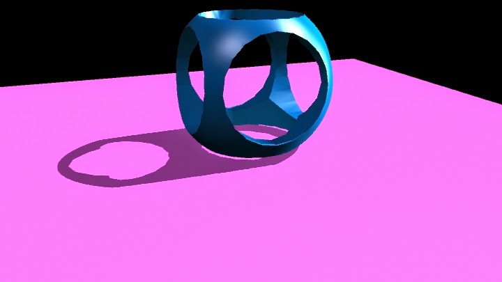
The Polything was my first attempt at learning the importance of light and shadows. I learned about ambient light, which illuminates the entire scene, but it could be manipulated to best display your creation. Spotlight is similar to that of a spotlight on a stage, where the light is a round circle that can be sharp and crisp, or gradually fade into shadows. Point light is a tiny ball of light, that can be directed to whichever direction best suits your project. Area light surrounds an object in a circular shadow, like looking directly above your creation and seeing it's large shadow surrounding them. I learned about how important the lights and shadows can be utilized to make an object look dramatic and beautiful, or soft and delicate. It's similar to the way graphic designers use this in movie posters to make the movie look hardcore or dramatic. I hope to enhance my abilities with this to make something really look realistic and can believably animate 3-Dimmensional projects. I do need to improve upon my usage of them, but I can tell as time went on I got better.
 Hammer
Next, we learned how to make complicated objects by warping simple shapes into real-world objects, such as a hammer. I used a cut face tool to evenly cut the face of the head of the hammer to create the teeth that are used to wedge nails from the wood. I used the extrude to make the round, more circular head of the hammer used to hammer in nails, as well as making the teeth from the back. This tool then can be used to warp the faces into even more shapes. Bevel is used to warp the very vertices into either moving them to set a more natural curve, or moved into another curve. I had improved since the polishing, and am starting to make realistic projects that can be immediately recognized by the general public. I'm very happy with how quick I'm catching on and excited for the next projects upcoming. Of course, I could use the surface textures better. I am improving however. I do believe that my projects will continue to be on this up going road.
Ice Cream
This was the first project that actually has a definite background and was meant to look realistic. This was also the first project to test out bump maps to have the natural, bumpy surface of ice cream. Bump maps can be added to give the object a 3-D texture that gives a bit more depth than regular just surface texture. Later on, I created a "lazy susan" platform to animate and make a revolving, looping and smooth transition to show off the ice cream I created. Of course I had problems, like the ice cream parts flying off in different directions and the kinks in the animation, but eventually I overcame these small issues and I quite like this animation. I learned the importance of keeping the bump textures correct in this creation, as they can change when you render out movies. But I quite like the way it revolves and the realistic qualities of the ice cream, as it was very fun to see different designs to test out. However, I would change the Cone holding device, as I realize that it looks the least realistic out of all of the aspects, and the bowl, as I know I could've done better on some of the attributes of the bowl, like it could be a hard shiny plastic. Yet I like the final project. I am very proud of this animation.
Bouncing Spheres
I knew one day that eventually we had to create effects inspired from real life, but didn't expect it to be a throwback to my first 2-D animation, the bouncing balls. We observed the actual time it takes for the three different balls to bounce. A bowling ball, a tennis ball, and a golf ball. This was the absolute first test with animating with keynotes in Maya, a keynote being each individual frame. Observing when each ball reached their peaks and when they hit the ground, I was able to properly use small squash and stretch techniques to make them feel real. But yet problems still existed in the form of the balls slowing down due to the way the graph editor was set up. Fixing this by going into the animation edits menu, and clicking on the graph editor, I was able to find the problem and solve it. One simply has to make the stream of keynotes linear, so that the animation doesn't slow when the balls hit the ground.
 The Cup
This was a new experience, even in Maya. Creating a figure drawn out in the side view by a create NURBS curve tool, then using the revolve tool to make it 3-Dimmensional. I then moved the 3-dimmensional project away, so I could warp the skeleton of the cup while seeing what it did to the actual cup. This way, I could make sure that the changes I made were for the best. By now, I had created many scenes to place my creations in, and I believe I'm getting good at it. This time, I made the reflectivity higher so it shines like metal, a gold color that boldly distinguishes it from the background, and made it basically look like the Holy Grail from the King Arthur legends. There were no problems with this project, and am excited to utilize this in the future for when I create new 3-D characters.
 Salt Shaker
This salt shaker was created the by warping a circle into a strange shape and lofting a skin over top to make a 3-D figure. Lofting is when you have a shape's layout skeleton in Maya, one layer on top of the other. Then you go up into the Surfaces menu and select loft. This time, I had to create a second shape similar to my salt shaker, so that I could have salt inside the shaker.Also, I created a large cube to make a room where the salt shaker is, while adding lights and effects to make the salt shaker stand out prominently against the walls and floors. The only problems were finding the correct type of blend to find the best amount of luminosity and transparency to make the shaker appear glass, while darkening the lid and brightening the reflectivity to make the lid look like a strong plastic. The salt was created similarly like the Shaker, except scaled smaller and added a rocky texture to it, so one can see the sand sticking out. However, it came out perfectly and I couldn't be happier.
 The Polything was my first attempt at learning the importance of light and shadows. I learned about ambient light, which illuminates the entire scene, but it could be manipulated to best display your creation. Spotlight is similar to that of a spotlight on a stage, where the light is a round circle that can be sharp and crisp, or gradually fade into shadows. Point light is a tiny ball of light, that can be directed to whichever direction best suits your project. Area light surrounds an object in a circular shadow, like looking directly above your creation and seeing it's large shadow surrounding them. I learned about how important the lights and shadows can be utilized to make an object look dramatic and beautiful, or soft and delicate. It's similar to the way graphic designers use this in movie posters to make the movie look hardcore or dramatic. I hope to enhance my abilities with this to make something really look realistic and can believably animate 3-Dimmensional projects. I do need to improve upon my usage of them, but I can tell as time went on I got better.
 Hammer

No comments:
Post a Comment