The Top Ten Things that Inspire Me:
The Main Idea
There are inspirations that drive us all. Ones that make us happy to push to beyond the limits set by our peers. Mine drove me to even make the decision to go into the e-Communication program. Deciding that making a classy poster to honor the objects that keep me continuing on through this long trek called high school, I went into it with enthusiasm, but also with hesitation. Making these kinds of projects are always making me strive for perfection, yet with a deadline, it was difficult.The Process
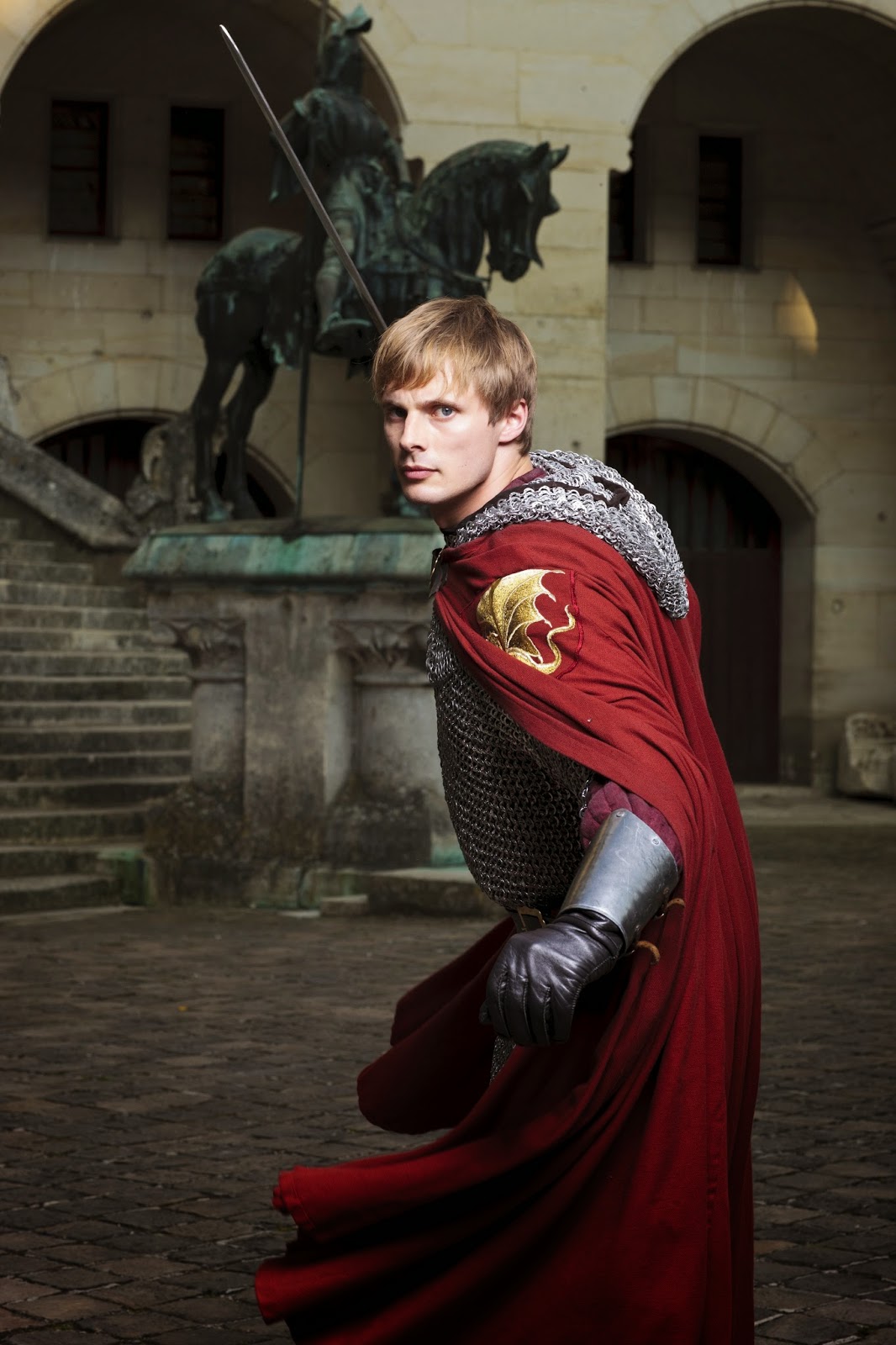
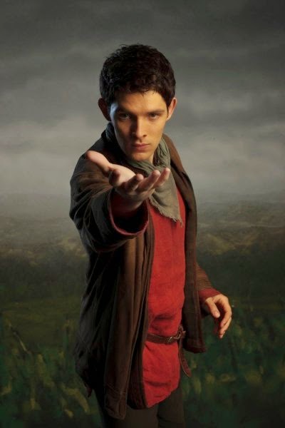
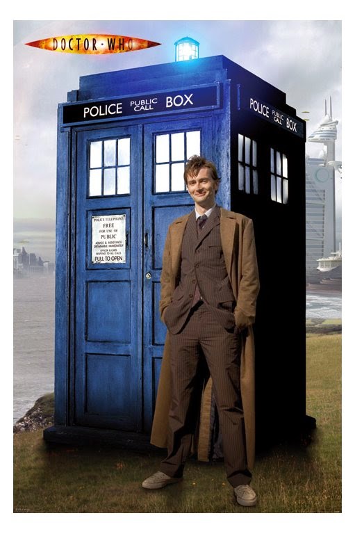
 The entire project was brought to life by InDesign, yet another program created by Adobe that helped me achieve my masterpiece. I used a ruler tool to map out what would go where, and also being inspired by a style of an article from a magazine, involving text curving around pictures and everything perfectly split into two separate sides. I found pictures from the internet for common objects I loved, such as the Panic! at the Disco Photo, the posters for How To Train Your Dragon and Lilo & Stitch, the laptop, and the British TV show collage. I edited each photo within Photoshop to either increase clarity or to combine different photographs into one. Example being, the collage of British TV shows. I had taken separate photos of each of the shows I loved and brought them together to make one big conglomeration of my favorite shows, with my favorite characters at the helm.
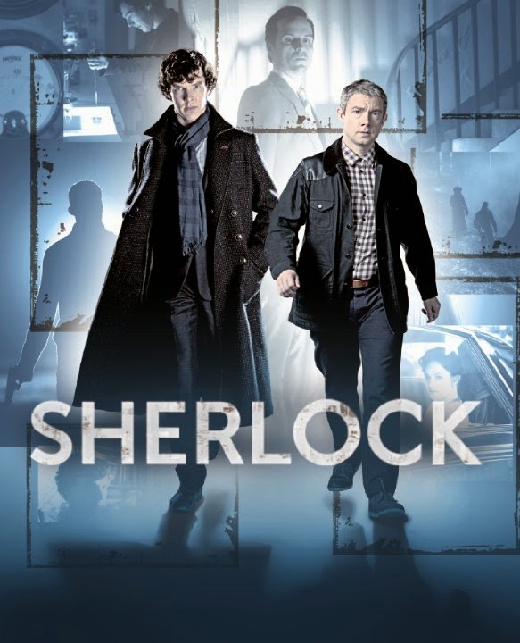 Then using InDesign's multi-fillable box tool, I placed the boxes within the grid I laid out, to be filled with text or pictures. I used the place tool to then put my edited photos into the poster, which by then had started to come together quite nicely. The only issue then was creating the several different type styles. Using the text styles box, I created three different styles, one for titles, one for the curving texts, one for the titles. I made sure to edit the colors to make them visible among the dark pictures as well as being able to be seen among the lighter colors. I then placed the text into the different fillable boxes. Finally, I warped the text into different curves so to parody that previous style I had seen.
Reflections
I believe I could have done the text a bit better for the curving, as well as a better color, but I believe I did a good job for the first time attempting a new type of program such as InDesign. I loved the pictures, especially the one I edited from the British TV shows. I wouldn't change a thing with an exception of the type palettes used. I hope to use this knowledge when need comes for it again, maybe making a movie poster. I can't wait for more!

No comments:
Post a Comment