Saturday, November 22, 2014

In the Shadowed Path

Casting Shadows

Link to Morguefile.com:
http://www.morguefile.com/


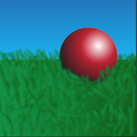
This project was used to learn how to create a shadow for an object inserted into a picture in Photoshop. I obtained both photographs from the website Morguefile.com. After downloading both of the files, I opened them in Photoshop. Using the quick selection tool, I quickly took the leopard out of it's original photo in order to get the leopard by itself. But still, there was a faint outline of the original background. Using the Defringe tool to eliminate this annoying pixel fringe-like halo, I was finally left with the Leopard alone in a transparent background. I then copied the layer of the Leopard in Photoshop, and used the warp tool to shape the duplicate layer into a shadow position. Gradients were then used to create the dark to light contrast within the shadow. Finally, I lowered the transparency of the shadow so there could be showings of the background layer peeking through the silhouette of the Leopard.
Along the way, I learned how to warp duplicate pictures into shadows just by using a warp tool to make it look like the shadow is natural. Also, gaining the knowledge about how the project can be used, like to make a book cover or a poster look realistic.
I loved the resulting picture, but next time I would swap out the picture of the Leopard to do a different animal, so as to see how they would compare to my completed project. Yet I would keep the background picture, as I feel it is a perfect picture to practice inserting other animals into.
For future projects, I would use the shadows for making realistic photo alterations. Like attempting to create a poster for a movie I saw. In general, I believed this project to be a fun and great success, and I am excited for future endeavors utilizing new skills acquired by the actions needed to fulfill the requirements for this project.

Monday, November 10, 2014

The Love-ly Isle of Dracon

The Love-ly Isle of Dracon


The Floating Island entailed learning about extracting pictures and eliminating the pixel fringe around the image so you could combine several pictures together to form an entirely new photo. Using Photoshop, I extracted the island from a photograph of an island off a beach. I then embedded it into the cloud photo used behind. Taking a copy of both pictures, I copied them and made the copies darker so it has a dramatic feel to the photo. I then selected a cloud and copied it in front of the image of the island, to make it feel like the island wasn't just pasted in front of a picture. Along the way, I found out how to copy a selected portion of the isle to create a point at the end of the island to make it look like a spire.
Finding dragon pictures on the internet, I embedded them into the picture to make them look like they're flying around my floating island. I found out how to cast their shadows on the clouds by using a dark brush tool set to a low opacity. Finally, I used a picture of stars, set the picture in front of all of the others, and then used screen lighting to get rid of the black space and leave the stars as snowflakes blowing in the air. All in all, I loved the project, as I got to exploit some of my creativity. But one thing I would change if I could would be the type of dragons I chose for this project, as they were not the easiest to embed. Yet the snow I would keep, as it makes me feel like my project stand out among my peers'.
Perhaps in future projects I would be able utallize the abilities to take out photos and combine them in different ways so I could create things like book covers or posters. I truly enjoyed this project and hope for more like this to come in the near future.


Tuesday, November 4, 2014

Sphere Projects

Sphere Projects


Shiny Earth Tutorial Link:
http://design.tutsplus.com/tutorials/create-a-shiny-earth-with-photoshop-3d-layers--psd-4838
Glowing Layer Sphere Link:
http://design.tutsplus.com/tutorials/quick-tip-create-a-colorful-sliced-sphere-to-use-as-a-logo-design--vector-4087


Spheres represent the world, how large it could be and how small at the same time. How it feels both safe and unique. Spheres can also mean the entirety of province or domain of an object, like how AT&T's spherical logo represents their worldwide coverage. I created two different spheres for Illustrator and Photoshop, a glowing sliced sphere from Illustrator and a 3-D Earth reflection from Photoshop.
The work for both Illustrator and Photoshop was relatively smooth, little to no problems from the exception in Photoshop to try and get a cloud layer to connect with the 3-D earth. But in Photoshop, it was easier to create a 3-D look, accomplished by wrapping a photo around a sphere, to apply the shadows and drop shadows to each layer, and to change and redo the aspects of each sphere.
In Illustrator, the effects was much more detailed, the glowing effects looked more natural and beautiful, and the sphere looks vivid and lively compared to Photoshop's.
I learned something different for each tutorial, to create a light, glowing feel to objects in Illustrator, and how to create cool 3-D images in Photoshop by making a picture wrap around a 3-D figure to create a cool effect.
But I do want to learn about how to create other 3-D objects in Photoshop, instead of just spheres. Like how to create characters that look and feel realistic. In Illustrator, I hope to learn how to create glowing effects to other objects, like creating a neon text font.

Sunday, October 19, 2014

Invasion of the Spheres


Spheres have a strange connection to logos for a long time, from AT&T's logo to Pepsi, they show us the influence they have on the world. This week, we learned how to create a 3-D sphere on both Adobe Illustrator and Photoshop CS6. We learned how to utilize the different styles and techniques that are preformed by each program, how we can prefer one over the other, and the different ways you can make spheres in separate programs for use for a logo or whatever else is needed.
The sphere to the left was created in Adobe Illustrator using a Sphere tool and using a radial Gradient tool to make the effect of light and shadow for the sphere. We created a shadow by making the gradient from dark to light, reversing it from the gradient used on the sphere and attached the circular shadow to the bottom of the sphere to give it a shadow from the light source. For this project, I made it my own by adding grass and a sky background to show that the sphere is resting on something. However, for me at least, this program was harder to achieve because of the confusing way the gradient tool on Illustrator was. But once I puzzled out the problems to be fixed, the process afterword was relatively easy. The values of the sphere were a bit wonky to try to balance out, yet again, once you found the balance to make the sphere realistic, it could be accomplished with less work.
This sphere was created in Photoshop CS6, again using a Sphere tool and coloring the sphere with a Gradient tool. This tutorial I liked better because of the easy to follow directions and the steps were easily accomplished. But using a blur tool, you could make the sphere a bit "grainy" in a sense that it makes the sphere appear more realistic than the one from Illustrator. The Gradient tool to find the values to make both the 3-D shape and the shadow were easier to navigate through and to perfect. But to make this one my own, I made both the shadow and the sphere have a more "grainy" appearance than usual.

Thursday, October 2, 2014

The Story of a Logo

The Story of a Logo

Everything in a logo has meaning to you; the colors, type, or even the shapes we use play a part in showing the world a part of yourself. I kept the stars in my logo, as to me, they means the unknown. The uncharted territory. "The road not taken" per say. I like to see what going down that road will bring and what I can accomplish while doing so. The colors of my logo represent the personality I have, like how blue represents self expression. Or how the gold means that I like being optimistic. The font expressed how I still love tradition, but am willing to break down the old way of doing things and replacing it with stuff that I love to do and loved doing.

My process for developing my logo was that I made a few sketches in my sketchbook about designs that caught my muse. I was mainly inspired for some of my looks for logos by looking at fan made logos for shows like Doctor Who and Sherlock. I developed a couple logo ideas that I fell in love with. I made logos on Illustrator and soon got inspired to go freehand on the program. Then, after I got designs I liked, I started messing with the effects available on Illustrator like the Grain effect, or the Drop Shadow. Using a multitude of art boards on Illustrator, I could immediately stop work on one logo and start making another one. It did make things useful when I was struck to create the logo I really admire at the top of the page. The black star with the glowing gold letters with my name in cursive.


 I learned how to create 3-D effects by adding a drop shadow behind shapes or letters, to give an object a sort of glowing look by using a grain tool. But I do want to know how to create different animal patterns to find a logo I would fall in love with, like scales or feathers.

For what I did well, I believe that I did well with original ideas with the effects. The black star with glowing yellow letters is something I'm proud to show off as my logo. But I would do the design a bit different, maybe added a few four pointed star, as I do like the look of those better. I would also try to make the star a bluish color, as I want to incorporate my favorite color into my work.
For areas of improvement, I would do some of the shapes I made with line tool a bit smoother, as I know they weren't my best work.

The Plausible Impossible

The Plausible Impossible is a rule for animation where the character can break the laws of nature, but only if they don't know they are doing so.


One example is when Donald's cousin, Gus Goose, is shaking his hand so hard that he is actually picking Donald up and back down again with each handshake. The plausible effect is that since Gus doesn't know that he's actually lifting up Donald, he can do it without noticing he's that strong to lift up Donald with his hand. The impossible side is that no one can not notice that they are lifting someone up with a handshake. The fact that makes this believable is that some people, when receiving a handshake from a larger person, you feel like you're being bounced.


In the same clip, Gus is putting together sandwiches like he's shuffling a deck of cards. The reason it seems plausible is the effective sound effect that goes with the scene. Also, there's the fact that both the meat and the bread can be bent like cards, it could be possible to shuffle them. But it's impossible to do so as flawlessly as Gus does it. The reason behind it is that the bread and the meat could be as stiff, or bondable, as playing cards.


Later in the same scene, we see Gus having the bread and meat be thrown into his mouth at one time and swallowed in one bite. This is plausible because some people believe that they can stuff so much food in their mouths that they can eat even whole meals in entirely one bite. But this is impossible for Gus to completely eat the entire sandwich in one mouthful. The reasoning, that no one's mouth can hold that much food.

The fourth example I have found is Gus knitting a pot full of pasta noodles into a giant sock. This seems to be plausible to some audience viewers. Since yarn is similar to size and shape to noodles like these, that they can be knit together. Yet, another impossibility, as noodles are too soft and they aren't together in one giant noodle, they are in individual pieces much too small to make an entire sock out of them.


The final example I found in this clip of Donald and his cousin Gus is when Gus uses a straw to suck up all of the peas from a plate from the opposite side of the table, and that the train of peas can twist and turn easily. This is plausible, as if you are up close to peas, and you use a straw to suck the air around them, you can suck up the peas as well. So the reasoning, is that it must work far away as it does up close. But this is impossible, because the suction from the straw can't reach as far away as they depicted in the cartoon. Also, the peas can't swerve in a line like ants, as they are inanimate objects that can only be moved with a constant stream of air pulling them towards the straw.

Monday, September 29, 2014

Tutorial for Calligram in Illustrator

My calligram for Illustrator was to make the letters of my last name look like a dog. Using a combination of small, half opaque strokes of the paint tool, it made the letters look like they had different colored fur running down their sides.

I then followed the instructions to create the dog nose, whiskers, tail, and the claws for the paws. I made these using the pen tool and coloring them in with the paintbrush tool.

I learned how to make the calligraphy on photoshop seem like it has fur, to make drop shadows to make it look like the letters are floating, to create 3-D effects by using the pen tool to outline some of the features like the tail and dog nose.

I did well with the fur and to make it look like it was flowing in a certain direction and to have a bit of shading to the fur.

What I could do differently is to improve the quality of the nose, as it was difficult to make the nose look realistic.


I want to research how to make scales next for my next lesson in Illustrator. That way I could create maybe a scale-like look for my personal logo.  I love animals and I feel inspired by them, so I feel like the should be a part of my logo.

http://design.tutsplus.com/tutorials/create-a-furry-calligram-in-illustrator--vector-3965