The Classy Red Carpet Affair for Midwestern High Schoolers
eMagine excitement

eMagine is a film and art festival designed to celelbrate the Midwest's up and coming arts and film students. Displaying the best of the best, it is undoubtedly one of the best perks of being an e-Communication student. You get a nice evening out with your classmates, you see their hard work, as well as get inspired to improve your own, and you get experience of professionalism that one may see in the future. This contest is one of the better ways to ensure at least some are willing to go an extra mile to put in excruciating details into their work, in high hopes to win the top prize and get recognition for the hard work they had put into their projects. This event is one in which everyone within e-Communication gets excited for. eMagine just so happens to be the biggest contest for high schooler-run media in the area, with about 20 schools sending in the best of their best. Olathe Northwest has hosted eMagine ever since the school's opening, with each year getting larger with more fantastic entries than the years previous. This year being no exception. Last year, I vowed to enter in my own work for at least a shot of being in the finals. I myself entered in four of my own projects I was proud of into eMagine, but lost out to some who were better experienced than I was. Even still, I couldn't wait for this event, especially knowing many of my friends had made it to the finals!
The Night to Remember
I had gotten a nice dress for the occasion, knowing it was meant to be treated like a junior Oscars, with a classy feel as well as nice occasion. I went with my sister, who didn't get a chance to last year. As soon as I got there, I met up with my fellow friends within e-Comm and sat near the front within the middle section. So I got really good seats to watch, without any hindrance in my way. So we all watched everything from hilarious Christmas music videos to serious news packages, from my friend Katie Arpin placing 3rd in her entry to watching my friend Shona winning the animation category. I enjoyed myself and got inspired to do more, wishing I could one day be in the running for a Pixel (the award given out at eMagine). But this year, I was happy to be a spectator to the talent of my peers. Watching these videos reminded me of why I joined e-Communication almost two years ago. Of the talent that develops from our teachers' instructions, and I realized how much I've improved due to their tutelage. So now, I'm anxiously already brainstorming ideas for next year, finding ways to animate with better quality I've ever had been before.
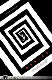
Animation
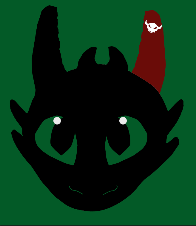
I believe that the animation section was brilliantly made and well done over the night, with the third place "Floating Islands" animation inspiring me, as well as the flowing smooth animation of the Dragon. The winners deserve their awards and I believe that the videos and animations were placed in the correct place.
Graphic Design
The graphics were executed with such grace and beauty that I'm impressed to see that it was made by high schoolers. My favorite of the night was my friend Katie Arpin's with her design for Amelia Earhart, as I saw her working on it, and it was brilliant. Her skills were exemplified easily and I hope to see her improve next year!
Video
The videos were well made, well produced, and kept me entertained and entranced the entirety of the night. But the one I loved the most was the "Christmas Vacation" video, as I laughed the entire time it was playing, it flowed smoothly, and the script was brilliant. I wish that we did a video like that as like a group e-Comm video for school, cause then everyone will have so much fun making it!
Web
I never realized the complexity of the websites until I saw the finalists. each one had its own unique flare that I found both inspiring and admirable. The "as Though Lost" website was so simple, and elegant in its own way. I looked at it later and couldn't believe students created it! Well done, my fellow e-Comm peeps!
Afterwords
Honestly, one of this year's highlights was eMagine, cause it gives me a broader perspective of my peers' achievements and work. It also gives me ideas on how to approach my own, not giving up and doing the best I can to start animating like I want to do professionally. This gives me the ambition I need to further enhance my skills, and maybe one day win eMagine like I've dreamed of. But I first have to learn even more skills than I already know. So, until next time friends!


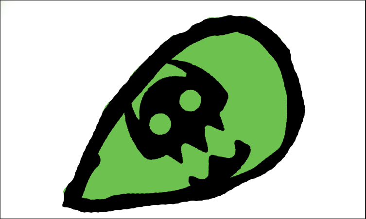
 I began working on the box outline, die line, and bleed line by using the shape tool, pen tool to create other shapes to construct a box. I then used the shape combiner tool to create the complete, whole outline of my box. I then set up a color palette to see which colors would work well with my company. I knew I wanted a blue, to coincide with my theme of skylines and clouds, but needed a color to contrast and complement it by itself. So watching lynda.com tutorials, I found a nice shade of purple that symbolized royalty and even magic. Afterword, I found a beautiful font called Head Case that seemed as imaginative and innovative like my product. But editing with the 'y' in Wyvern, I found that I had warped it to be an interesting dragon shape. So I kept the design as my main logo for the company. By then, I had amassed enough pictures to make the 3-D revolve, which was one of the hardest to accomplish due to the repeated problems I had making them, from the wonky bottle to the box not being copied, meaning that I had to create ANOTHER box just to showcase the opposite side. But I pushed through and endured through the trying tasks, and my final project turned out beautiful.